This post is also available in
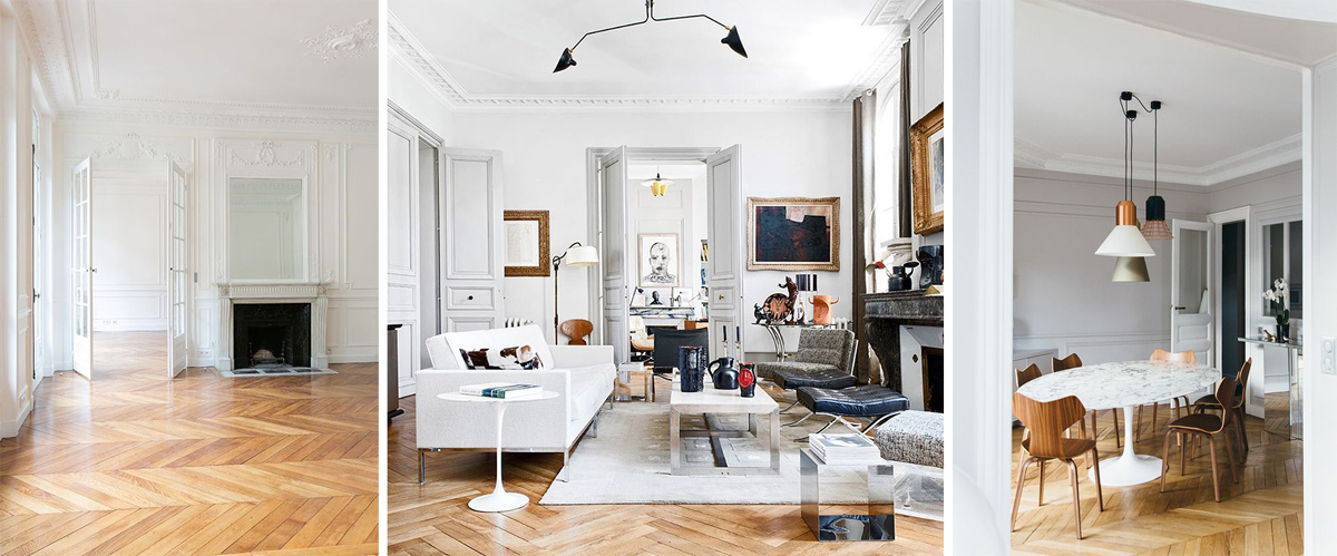
The parquet looks like the ideal floor in everyone’s dreams. Indeed, wood is a marvelous material, warm and “soft”, it offers infinite possibilities from the wood essence and colors.
The parquet of my dreams is the classic Nordic bleached with large planks or the Parisian “herringbone” floors.
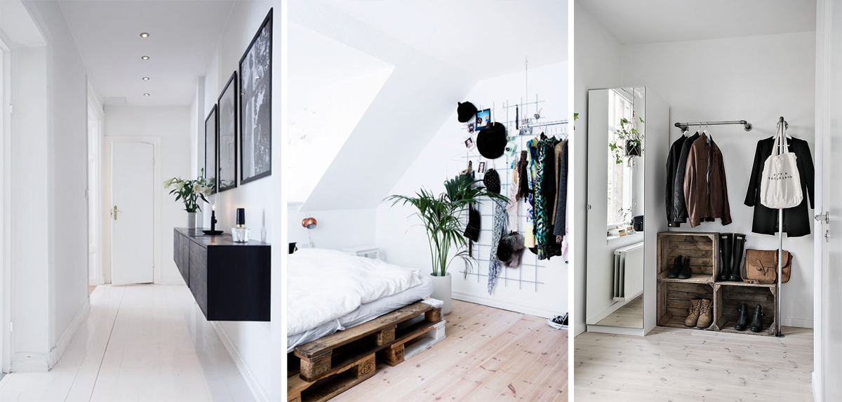
When we bought the house we were still in time to choose the floor. Immediately we dreamt of white parquet but when we clashed with the costs we immediately returned on the parquet the contractor chose.
Our parquet is called “industrial”: small strips of different colors and large thickness make it very resistant and durable, perfect for industrial spaces.
The thickness, of 2 cm or more, offers the possibility of being renovated several times without replacing it.
I must say that after 5 years that we live in here – we also have it in the kitchen – it is still perfect and shows no visible signs. Of course it remains a “challenging” floor, the industrial parquet is a bold choice.
We could have left it natural with a more neutral effect, but certainly with a more complicated maintenance. So we opted for the finishing paint, even if we chose the lightest and opaque paint, it add to it a finish touch that makes wood essences more visible.
But one thing I had never thought about is the combination with colors: depending on the essence that makes up the parquet, the floor will be characterized by a predominant shade. You can enhance these shades or try to damp them using right colors.
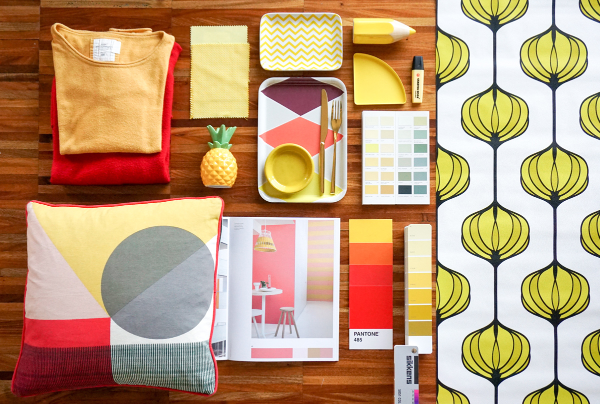
I hate the red/yellowish hue of our parquet, trying to avoid it I have to look for colors that damp them. Furnishing our first home we hadn’t the courage to dare with colors, we chose total white with touches of gray (for sofa, kitchen, chairs and bed). I decided to introduce a color to add a bit of personality but I did wrong.. what did I choose? Yellow! In my defence I can say that I chose a shade of mustard yellow that cooled the tone of the color.
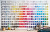
Can you see how yellow and red exalt the nuances in the same color of the parquet?
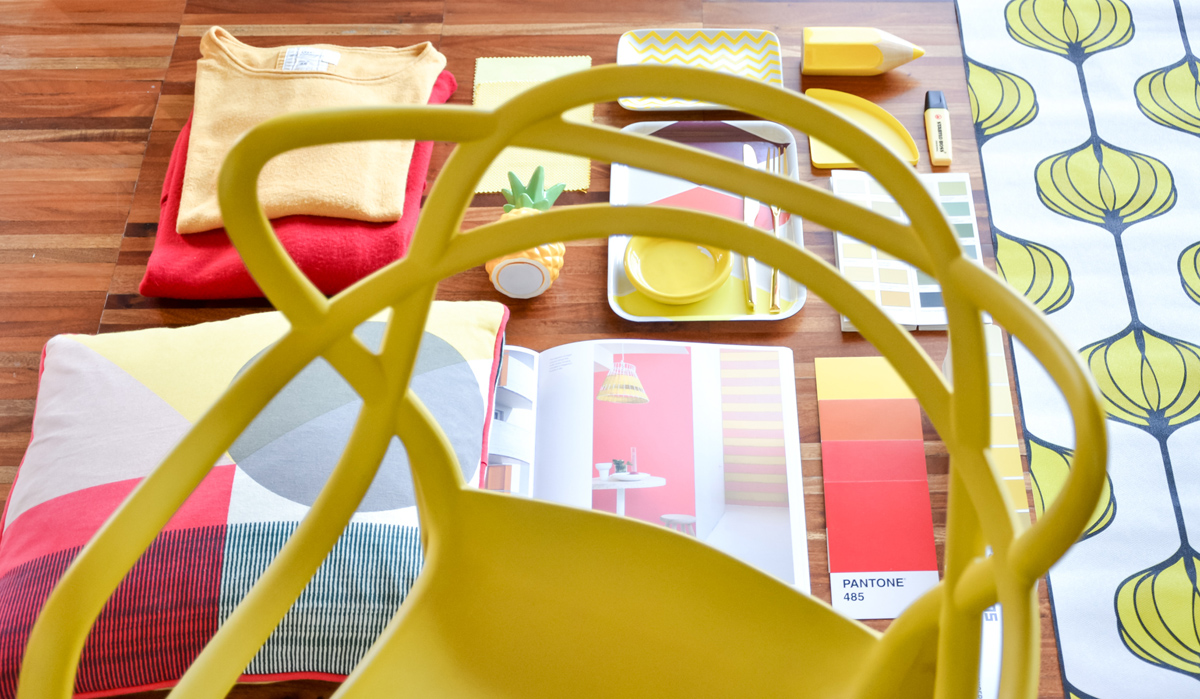
Around our white dining table we have 6 Masters chairs by Kartell that we love. Do you know the Masters? Designed by Philippe Starck in 2010, they are a tribute to three iconic chairs: Arne Jacobsen’s Series 7, Eero Saarinen’s Tulip Armchair and Charles Eames’s Eiffel Chair. Philippe Starck’s chair is the sum of the profiles of the three icons. This is why I love them so much and I would not like to change them (they are also very comfortable!). Our luck was buying them two in mustard yellow, two in gray and two in black. I believe that even after the restyling we will replace only the two yellow chairs.
After these thoughts on colors and nuances of the parquet I realized that the solution to make my floor more neutral I have to choose cool colors that do not contain shades of red and yellow.
Look how it improves: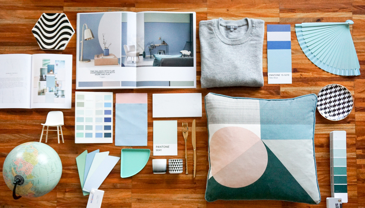
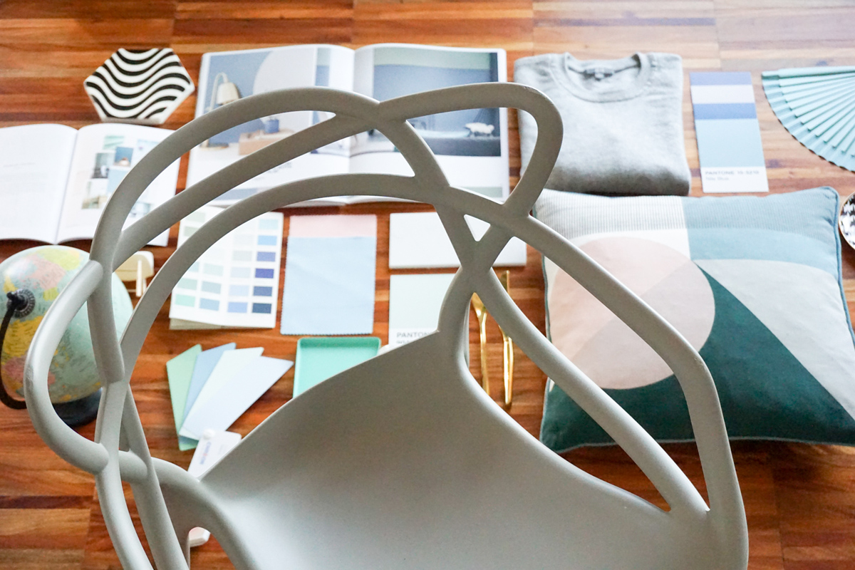
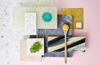
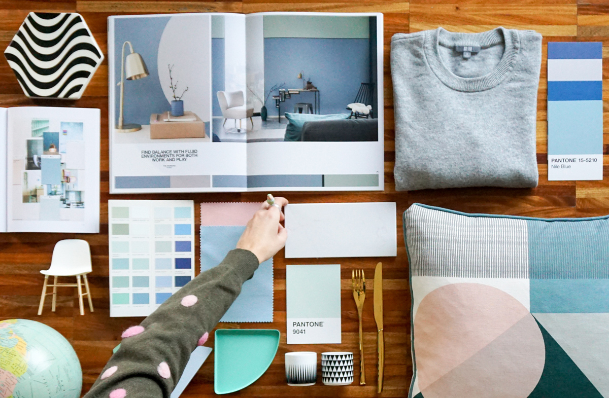
We are going firmly towards a palette of blue dust, desaturated blue and sage green that smells of gray. At home we have an old globe, given our passion for travel, I like to think that it is the inspiration for our restyling.
First of all you have to understand what type of floor and wood you like or what you have to live with, this will be essential for guiding your color palette choice for your home. So what did we found out today? We have to deal with the materials that we have, these can help and show us the direction to take!
You may also like