Leggi questo post in Italiano
Silvia Stella Osella is a textile and surface designer, color and trend consultant. Maybe not everyone knows what it means and how this is a dream job.
I asked Silvia to tell us more about her work and introduce us in the magic world of textile design and trend forecasting!
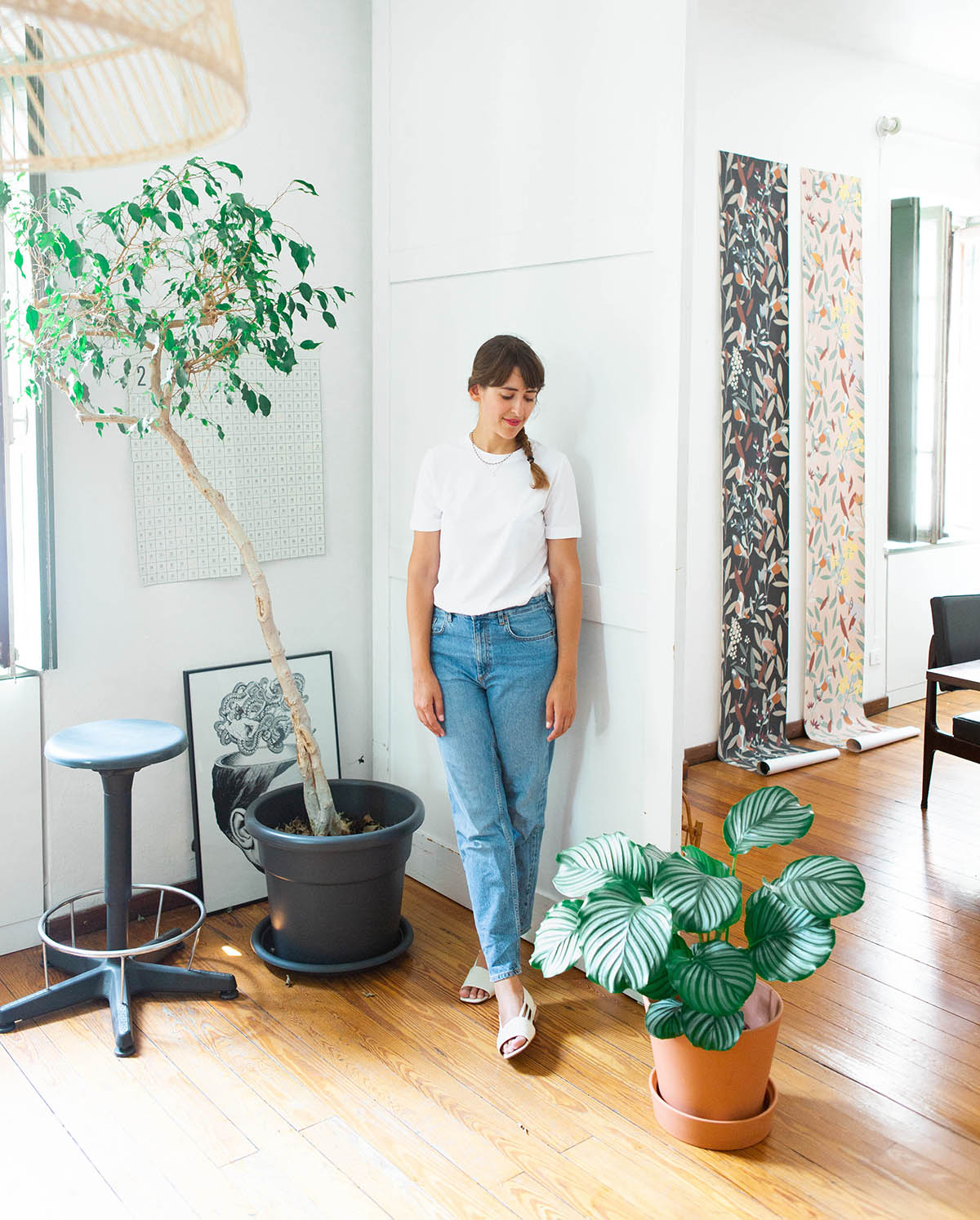
Silvia Stella Osella in her studio in Milan. Photo ©Michael Gardenia
Q. Can you tell us what a textile designer does?
A. Textile design is a huge discipline that includes many different things. In Italy we have very important textile districts, with a historical and artistic heritage (textile archivists are professional figures crucial in the organization and conservation of it). These realities have always been deeply rooted in the territory so a real national textile culture has never developed. This also reflects in the difficulty of finding training courses in the national area.
For example, the yarn and manufacturing district is located in Biella, while textile printing is more rooted in the Como area.
My job is design and create prints for textiles and surfaces (surface design means wallpapers, packaging, rugs…), I also coordinate textile collections production and I’m color and trend consultant for companies and brands.
Q. How did you become a textile designer?
A. In textile design there is a very strong technical component of knowledge of materials and processes. In Italy there are not many courses where study this things. In Como for example, there is the IED Textile design course but they are often included in fashion-related study paths.
Perhaps this is the reason because most of those who do this job come from different paths, from artistic studies, fashion studies… I studied illustration and then I specialized abroad.
In this job you learn a lot by doing, working experiences in companies are fundamental.
Q. Where do you get inspiration from?
A. I’m not an artist, I don’t create from pure inspiration. I am a designer, I create starting from the client’s brief and I have to keep in my mind the final goal and what the client wants.
Trend forecasting are a fundamental tool because it allows me to create something useful, coherent, suitable for a certain context and historical period.
The two components of my work are therefore closely connected: I make colors and trends researches in order to create prints and collections.
But of course, I still have to feed my creativity, travel is definitely an important source, but also visiting vintage shops, flea markets… I try to fill my eyes with different input. Everything can contribute to creativity.
Q. Was this quarantine difficult for creativity?
A. No, I can’t say that. Research is a fundamental part of my job but usually I don’t have much time to do it because deadlines and projects are always pressing. In these days work has definitely slowed down and I have had more time to focus on research. Having time disconnected from the daily routine and the usual rhythms worked for me!
Q. Can you tell us about the design process?
A. Everything starts from a brief with the client’s requests, then I develop a moodboard which for me is a way to visualize and tell the client what I have in mind. Then I draw some drafts and make tests on fabrics to evaluate the print, dimensions and colors. When we’re happy with the final version it’s time to send it to production.
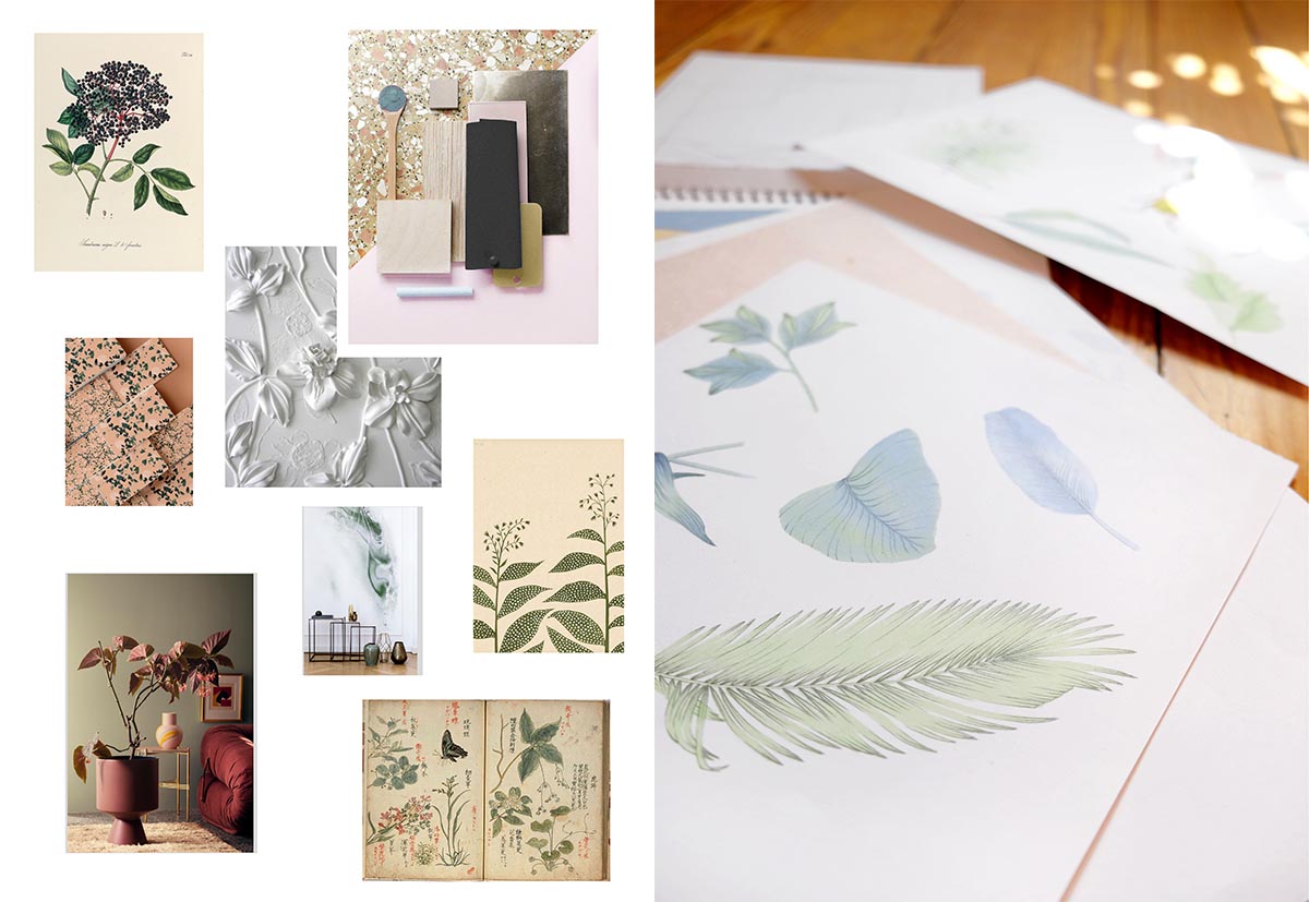
Moodboard and sketches for the Wall&Deco wallpaper
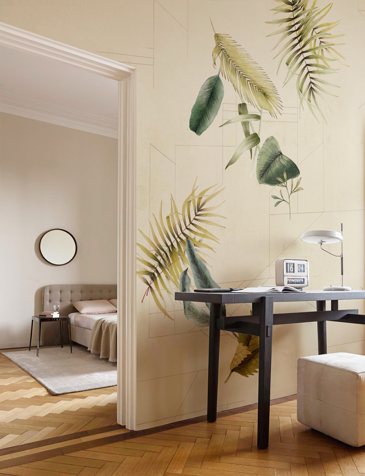
Wall&Deco wallpaper
Q. There are any differences when you design for the Italian or foreign market?
A. When I started working 13 years ago yes, there were differences. Now there are no more, mass market, fast fashion and online shops globalized styles and trends.
Q. How do you recognize a well-designed print?
A. Repetition doesn’t make the pattern! Textile design is a complex discipline, with experience you learn to understand what makes a pattern valid: the balance of the elements, composition, proportions, movement … Not to mention technical details and the evaluations of printability! There are many things to consider, and you learn them after years of experience.
Q. What is your favorite moment of your job?
A. Research!
Q. How do you search for new trends and colors?
A. There are agencies and institutes specialized in trend forecasting, with teams of different specialists (there are anthropologists, sociologists, professionals from fashion, interior, beauty…). These teams develop reports that become books and online trend portals (the most famous is WGSN).
The same goes for colors: they study how colors evolve in different seasons, such as reds cool or heat from one year to the next… it is truly a very fascinating and huge world.
My research is therefore a mixture of these tools and my suggestions, sensations, inspirations.
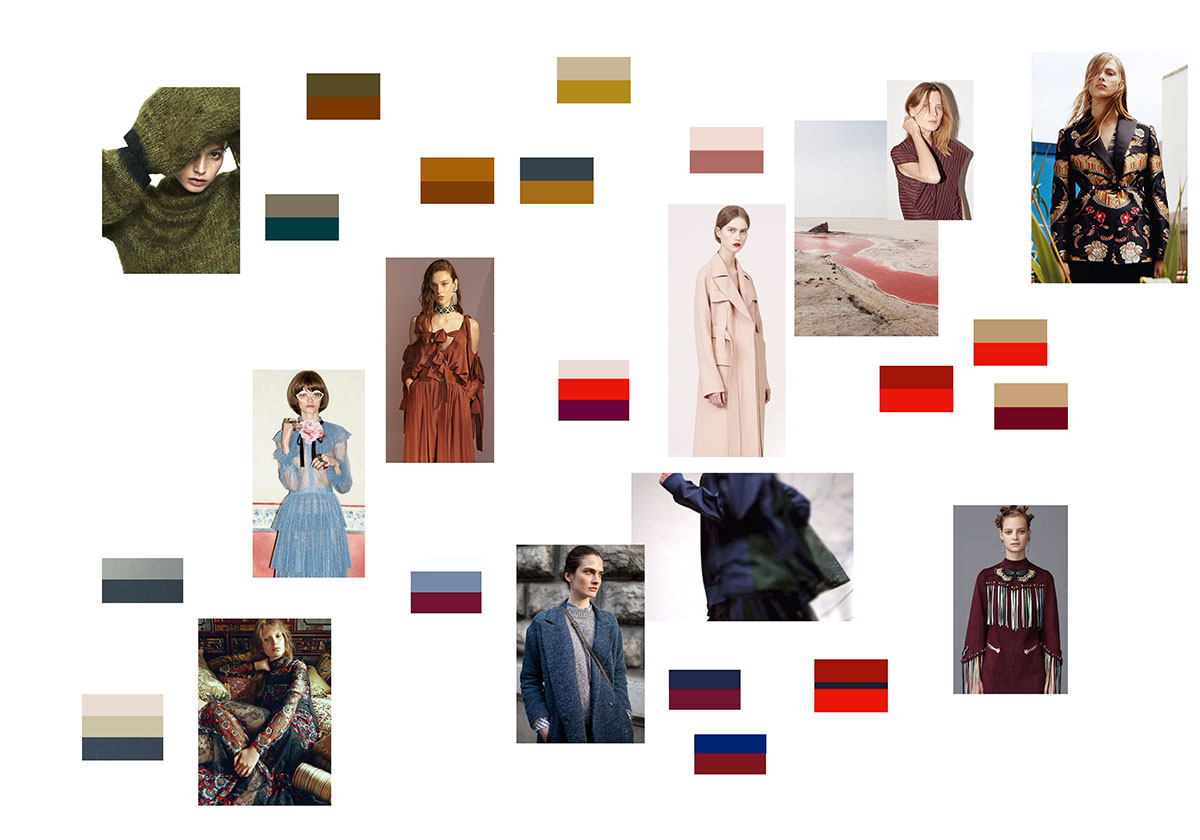
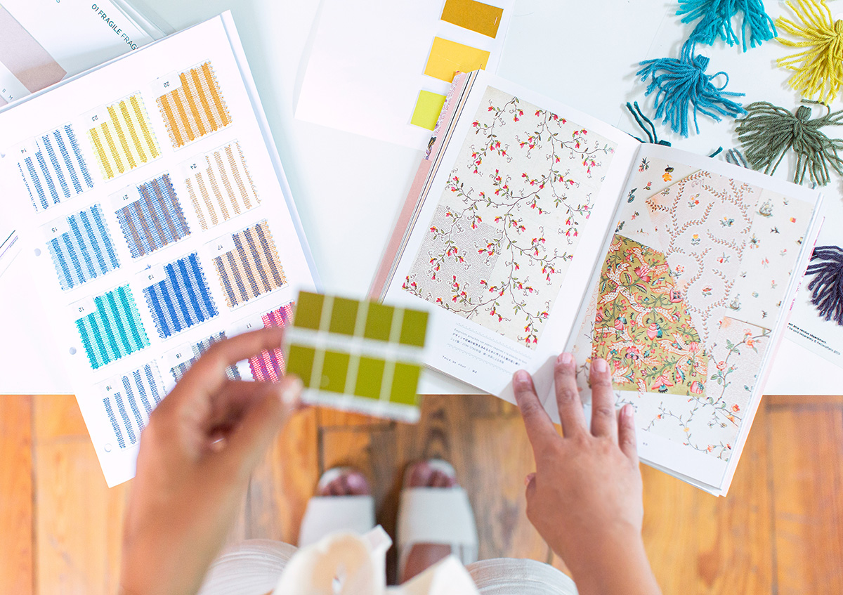
Silvia Stella Osella’s moodboard for colors and stripes
Q. If trends are global, why every brand announces different colors of the year? For example 2020 for Pantone is blue while for AkzoNobel is sage green.
A. We have to keep in mind that there are differences between areas such as fashion or interiors. Within these worlds similar color charts are developed and you can surely find a similarity between color ranges. Companies then develop a color palette and then they choose a color that is more a symbol of the message they want to bring, more than a real color of the year.
[Who knows what colors will be chosen for 2021 after the Covid19 global pandemia! ndr]
Q. What is your 2020 color?
A. Consider that I am always looking forward, I usually work with 2/3 years in advance! Now I’m working on 2021/2022!
More than one single color I would say the range of pastels, I really like how they have evolved into more sophisticated and acidic shades. It is very interesting to see how a color evolves to reflect a certain context or change!
Q. How has the work of textile designers changed with digital printing?
A. In traditional printing we were very tied to the cylinders printing diameter because the repetition of the design had to be enclosed in “one lap of the cylinder”. Today with digital printing everything has changed, we are much more free designing. However, we must still consider the final use of the fabric, if it will be used to create clothes, how it will be cut, try not to generate waste…
Q. What graphics programs do you use?
A. Sometimes I draw by hand and then import them into Photoshop, others I draw them directly in Photoshop, others using the iPad, others in Illustrator… it always depends on what I have to create. For example, I will hardly draw a geometric pattern by hand.
Textile companies have also softwares used to decline the same design in multiple colors.
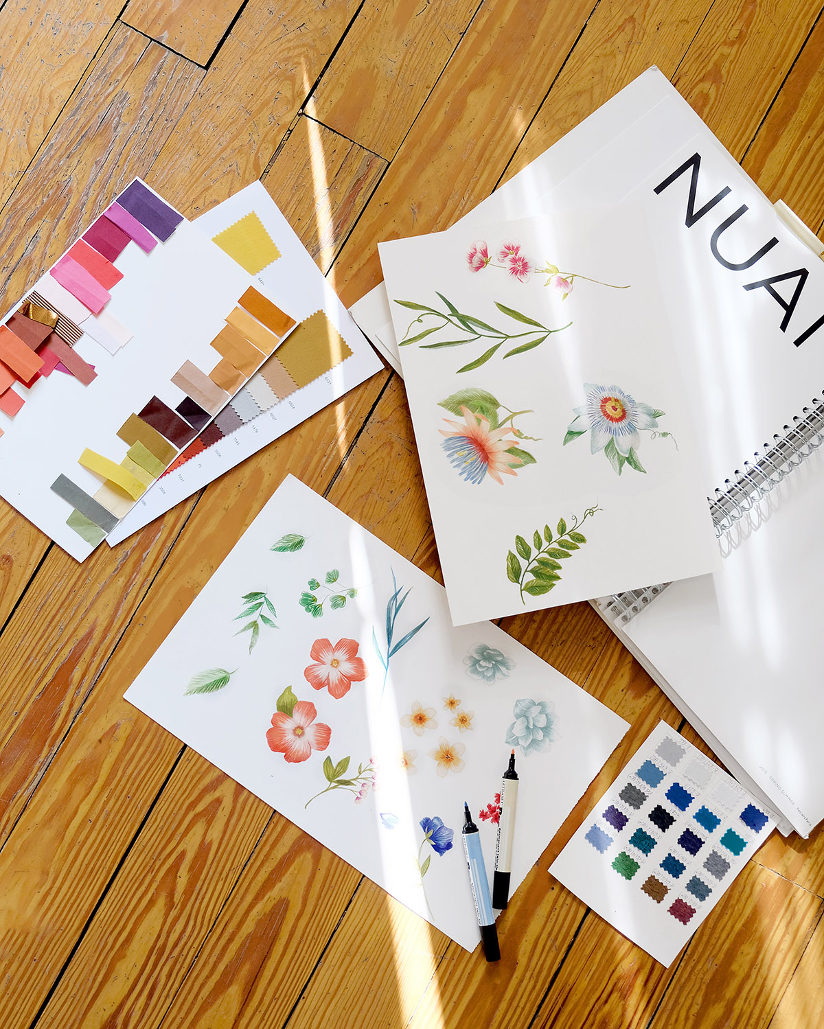
Botanical drawings handmade by Silvia Stella Osella
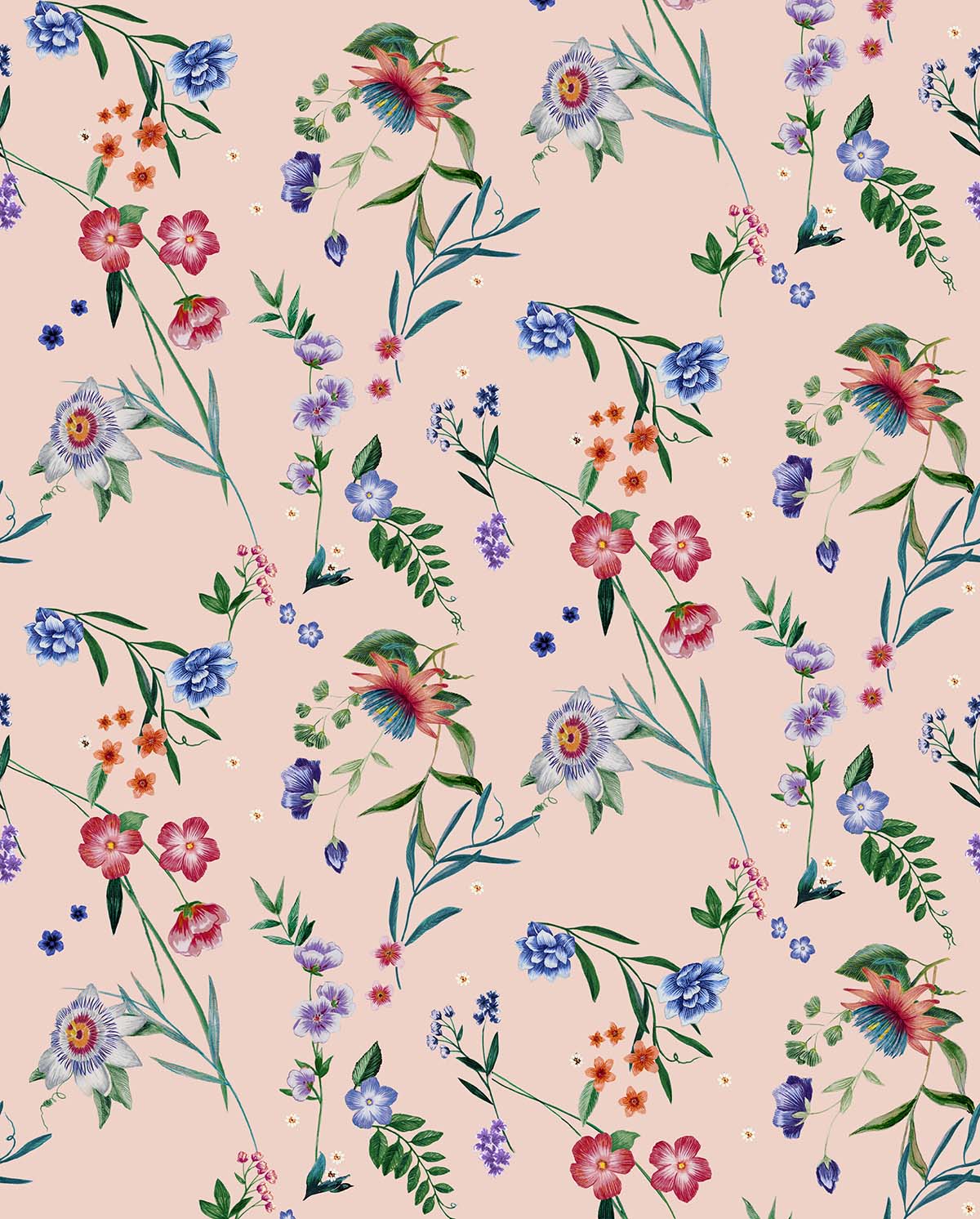
The final version of the botanical print she made with her handmade drawings
Q. Do you have any tips for mixing different prints?
A. It’s all about balance, very decorative surfaces are combined with light and solid colors. You can also play with textures.
Learning how to balance prints is very important. Plain colors are not neutrals, they have their own weight and help to create harmony. In the interiors prints must help to enhance the environment, for example in a large space I would not choose a crowded pattern because it would create visual “noise”, instead I would choose a more airy design, with spaced elements, to create lightness.
Q. There are many botanical prints in your portfolio, do you like designing them?
A. I like them, they are very much in my strings! I studied a lot of naturalistic illustration and, it must be said, they always sell a lot! Seasons change, colors change, trends change, but floral prints, obviously interpreted in different ways, are always requested!
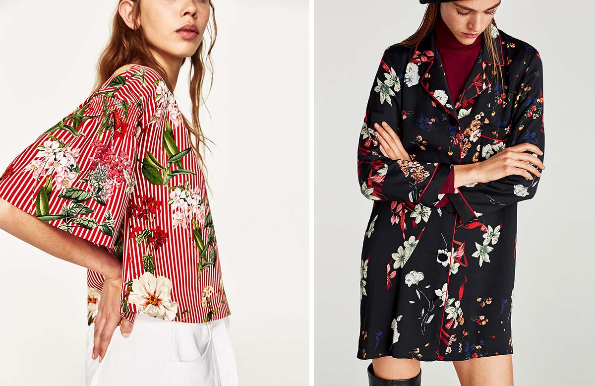
Floral prints by Silvia Stella Osella, Zara
Q. What’s your favourite colour?
A. I can’t choose! Doing this job I also re-evaluated shades and combinations that I didn’t like before!
Q. What are the most interesting fairs for textile design?
A. It depends, not every year fairs are all interesting in the same way and it also depends on what purpose you visit them, whether for research, work or exhibition. The most important fair for textile design is Première Vision in Paris.
It depends also on what focus you have. For many years I designed children’s collections and, at the time, I never lost one edition of Playtime in Paris, a fair dedicated to kids’ design where you can find wonderful brands. Other fairs are more fashion oriented such as Woman (Paris), Tranoï (Paris), Maison&Objet (Paris).
Q. Have you ever worn one of your print?
A. No, never, but not because I don’t like them! I think it’s a very common reaction for those who do my job. We are so overexposed to prints and colors that then we go for minimal and solid color! Even at home… all white, few things on the walls… I need to rest my eyes! Also being always so much deeply in trends make me fear of getting easily tired if I choose something too trendy. Basic always works for me!
Silvia is also a “sustainable fashion advocate” as you can read on her Instagram profile. During the interview we did not talk about it because the topic is huge. Follow her, you can find amazing contents in her highlights stories!
This interview is the transcript of the Instagram direct I did with Silvia Stella Osella collecting your questions. Thank you everyone for making this chat so beautiful and interesting!
Photo cover ©Michael Gardenia
