This post is also available in
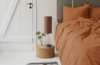
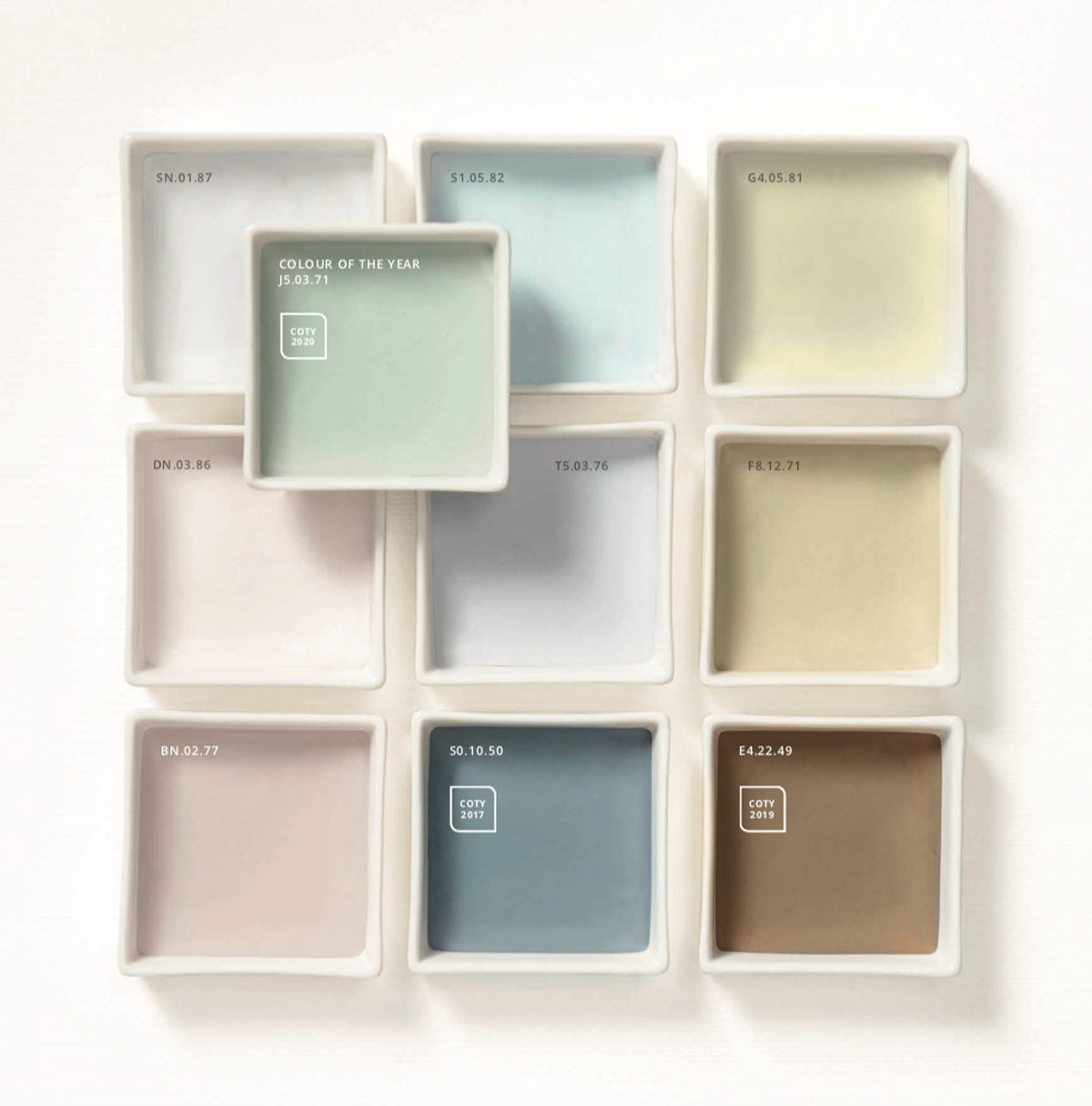
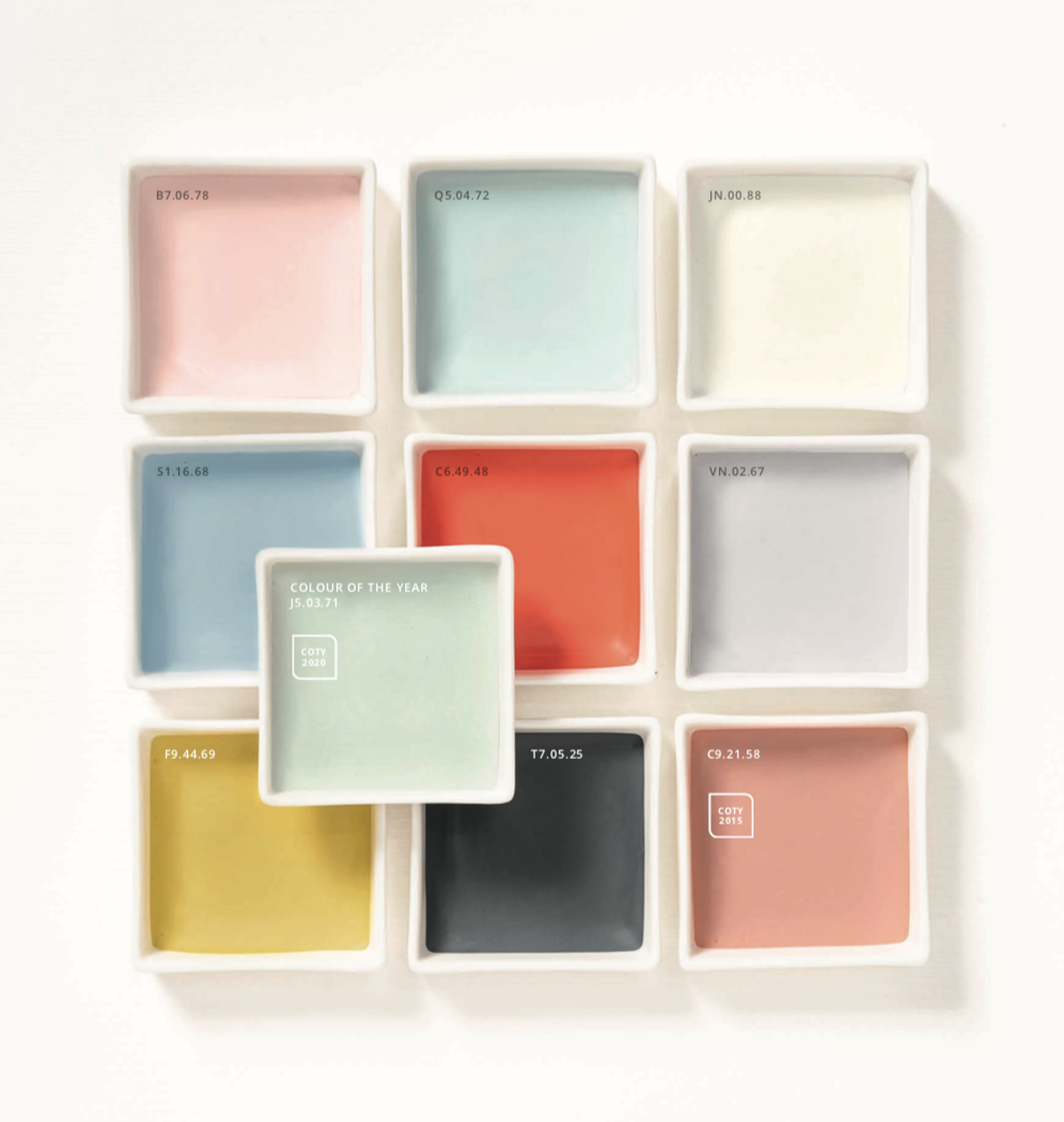
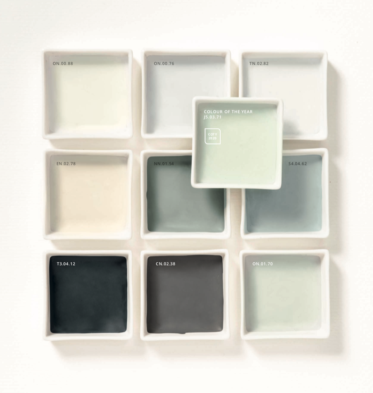
Tranquil Dawn is the AkzoNobel 2020 color of the year. It’s quite a light sage green with gray, green and blue shades inspired by the relaxed dawn colors.
What is behind the color choice of the year? How do they choose it?
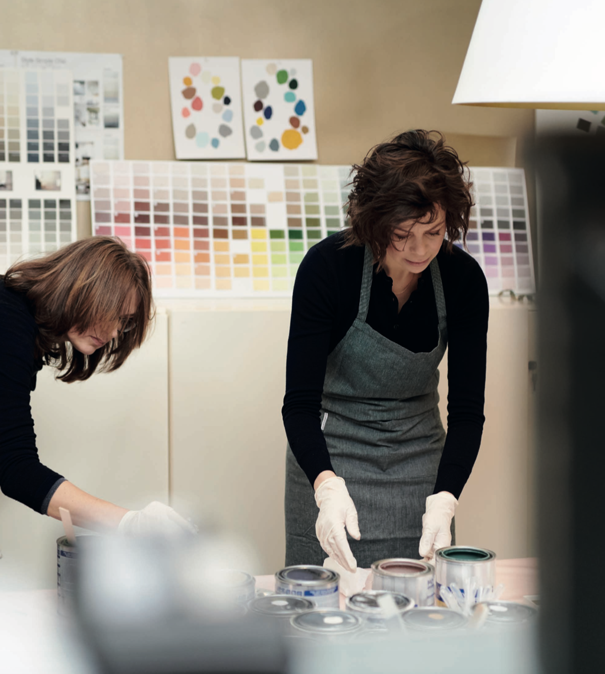
Every year a team of specialists from the Global Aesthetic Center of AkzoNobel in collaboration with designers, architects and color experts, analyze, study and explore emerging changes and trends worldwide. These researches are then used to identify the color of the year accompanied by four palettes that match four lifestyles.
I love how AkzoNobel is able to tell about this process through a wonderful book that every year is full of ideas and inspirations. Heleen van Gent is the Creative Director of the Global Aesthetic Center di AkzoNobel who masterfully introduces every year the color of the year and tells the story that led them to this choice. This is a full time job that lasts a whole year, 365 days dedicated to the study of colors and trends. Practically my dream!
This year the ColourFutures 2020 book starts like this “We’re excited to introduce you to the 2020 edition of ColourFutures, which tells the story of how we transform key global trends into inspiring paint colour palettes for the home”.
What can I add? Please Heleen, tell us the whole story!
As I told you before, the AkzoNobel Global Aesthetic Center team of color specialists (tell me if you wouldn’t want to be a color expert too!) meets every year in Amsterdam with designers, consultants, architects, creatives and trend analysts (another dream job!). For three days they discuss trends together, not only about the interiors but with a 360 ° opening from cultural, societal, economic factors to fashion, lifestyle and design trends.
From this huge brainstorming emerges a mood felt globally. To make the research even more difficult, the forecast must be projected into the future. How this common feeling will influence people’s desires? What inspirations will they want to bring into their homes? All this must be translated into a color for wall paintings.
After this they identify a central theme that for 2020 is: The Human Touch.
“As a reaction to the digital world, people want to bring meaning and wonder into their lives” Heleen van Gent
It is very interesting to see how since 2004 the colors chosen as color of the year became more and more neutral and how until 2011 sunny shades were prevalent. These observations could be read as the people’s desire to bring positivity in their interiors has turned into the desire to create a space where to relax and feeling safe. 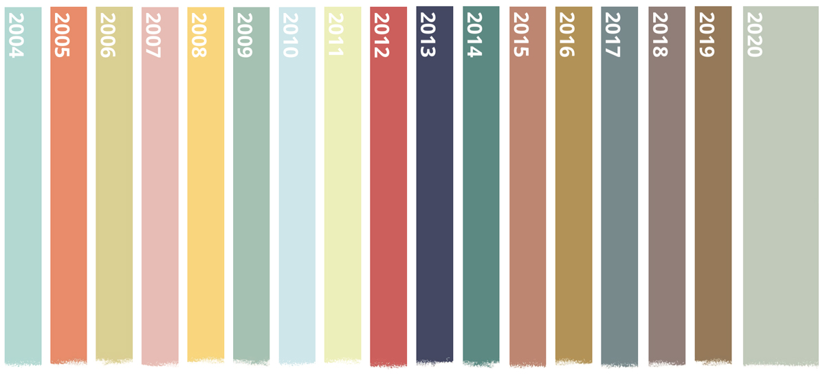
With the “Human Touch” theme in mind, the Global Aesthetic Center team identify the color of the year that will have to be versatile, respond to people’s needs and bring the spirit of the mood into their homes.
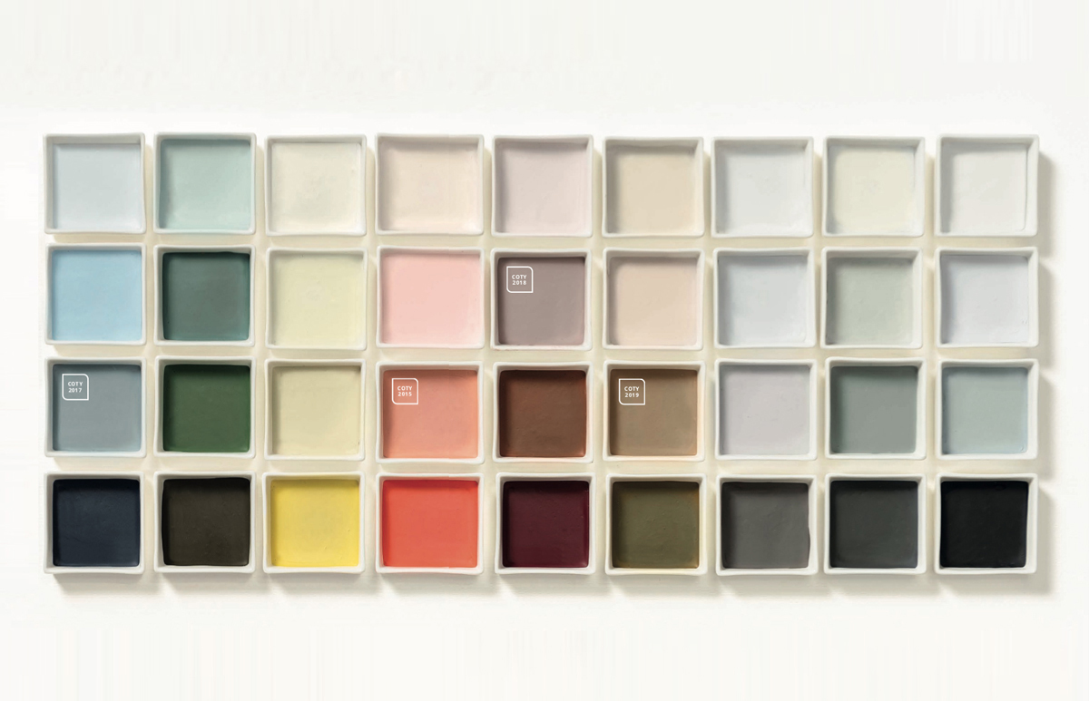
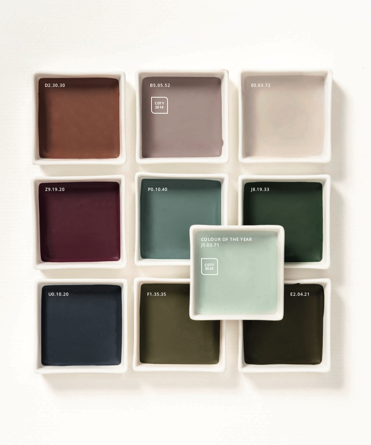
Around the color of the year they develop four palettes that bring together different colors. Four palettes that can accompany the color of the year giving each time a different character and in which people can recognize their own style.
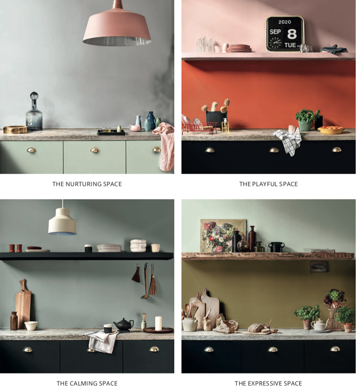
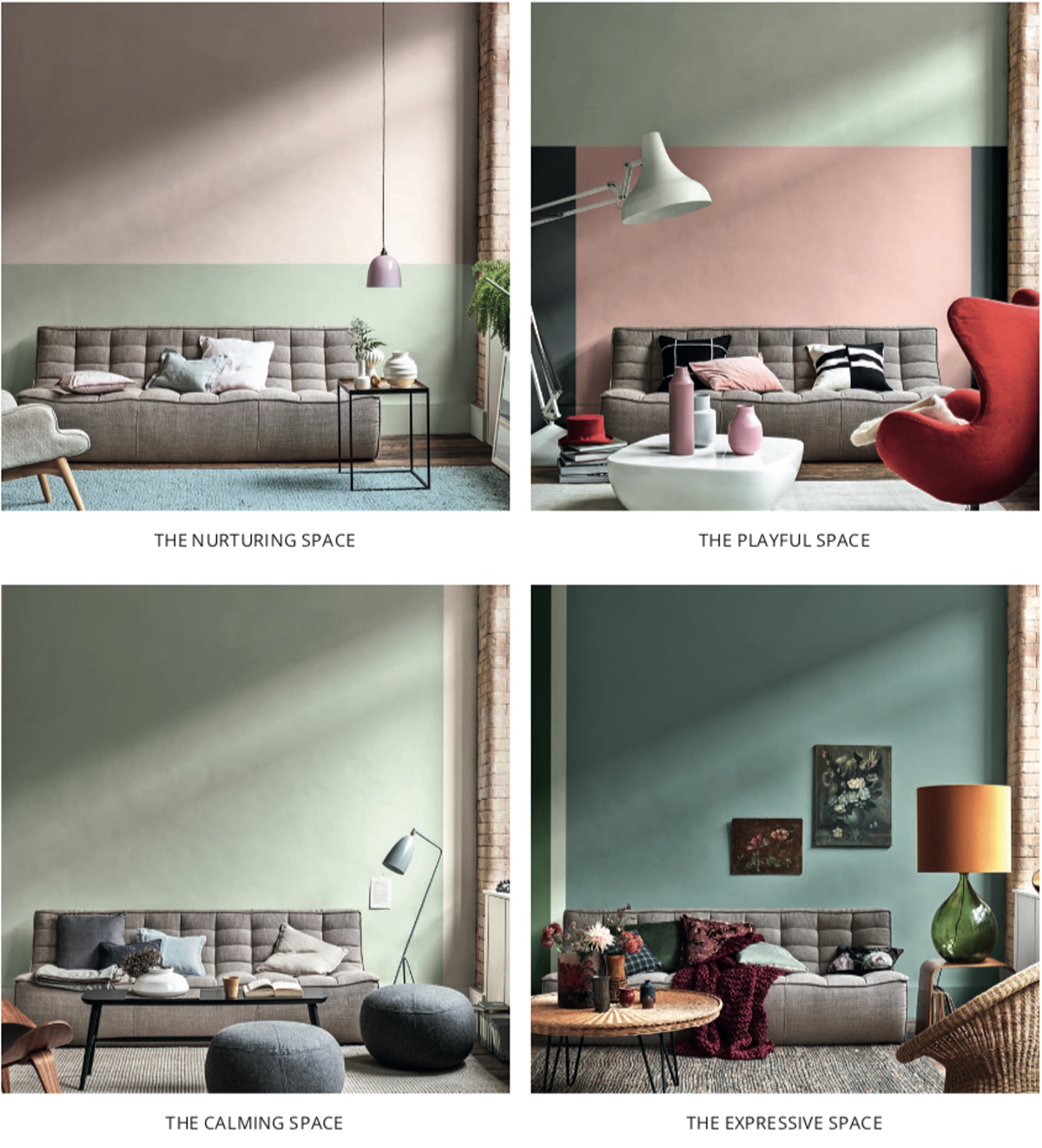
Four color palettes for Tranquil Dawn 2020:
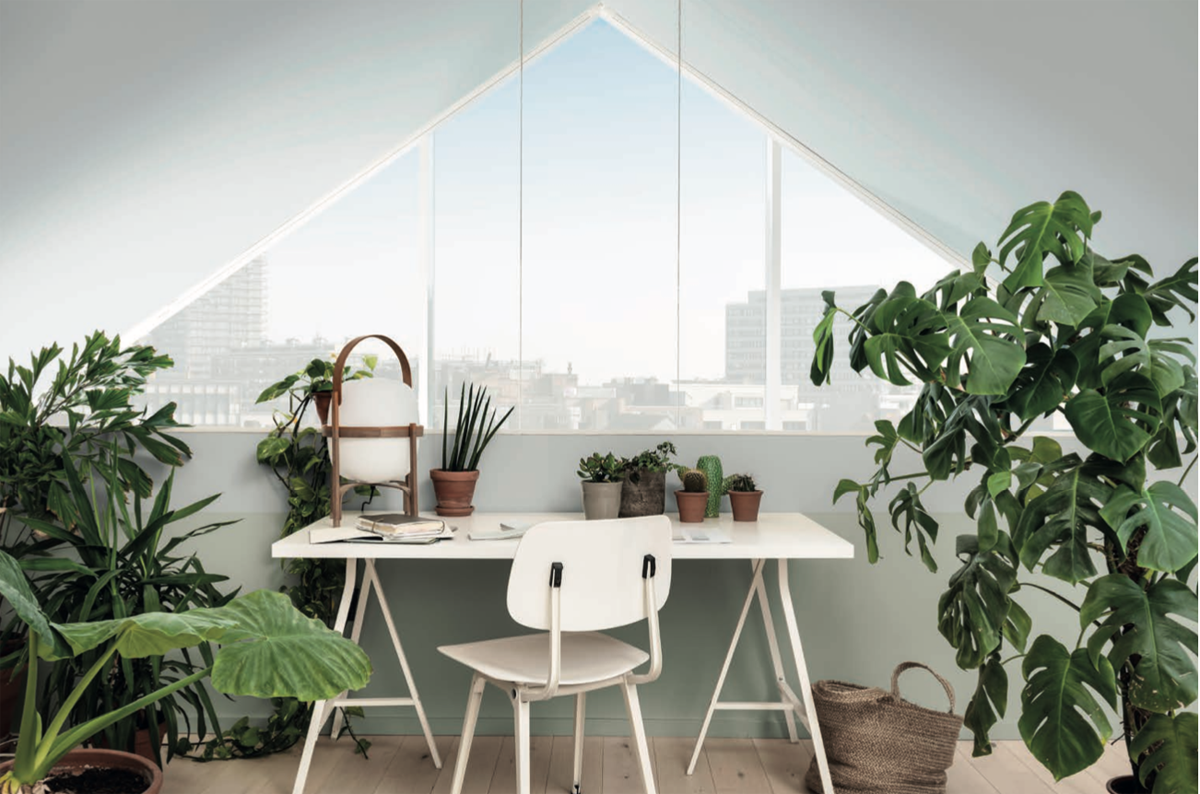
The Care Palette
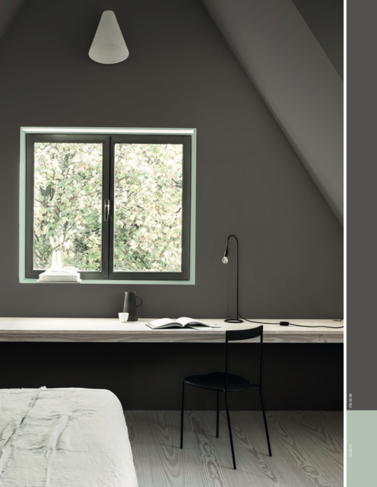
This palette is dedicated to those who want to create a relaxed environment where they can feel good, disconnect from technology, rest, recharge, find positive suggestions and bring nature indoors.
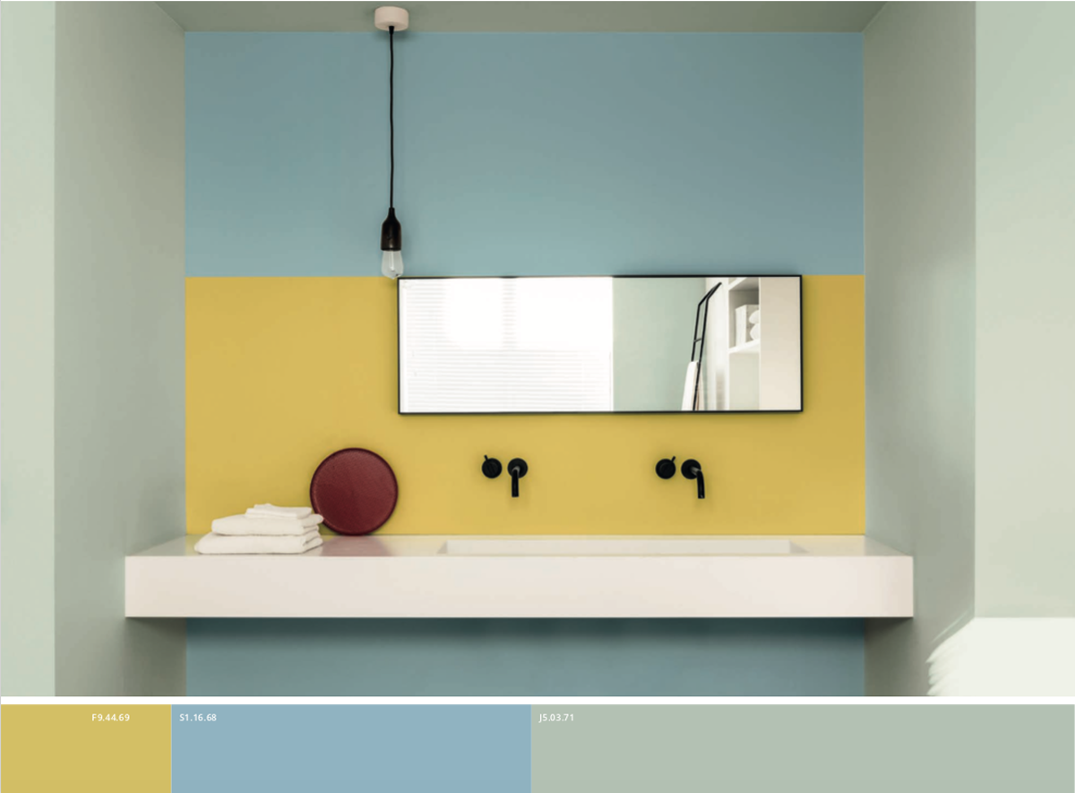
Colors are pastel shades, neutral tones to represent a relaxed and natural style, perfect if combined with light woods, many plants, soft velvets and metallic accents. Tranquil Dawn here is a spring dawn, fresh and clear.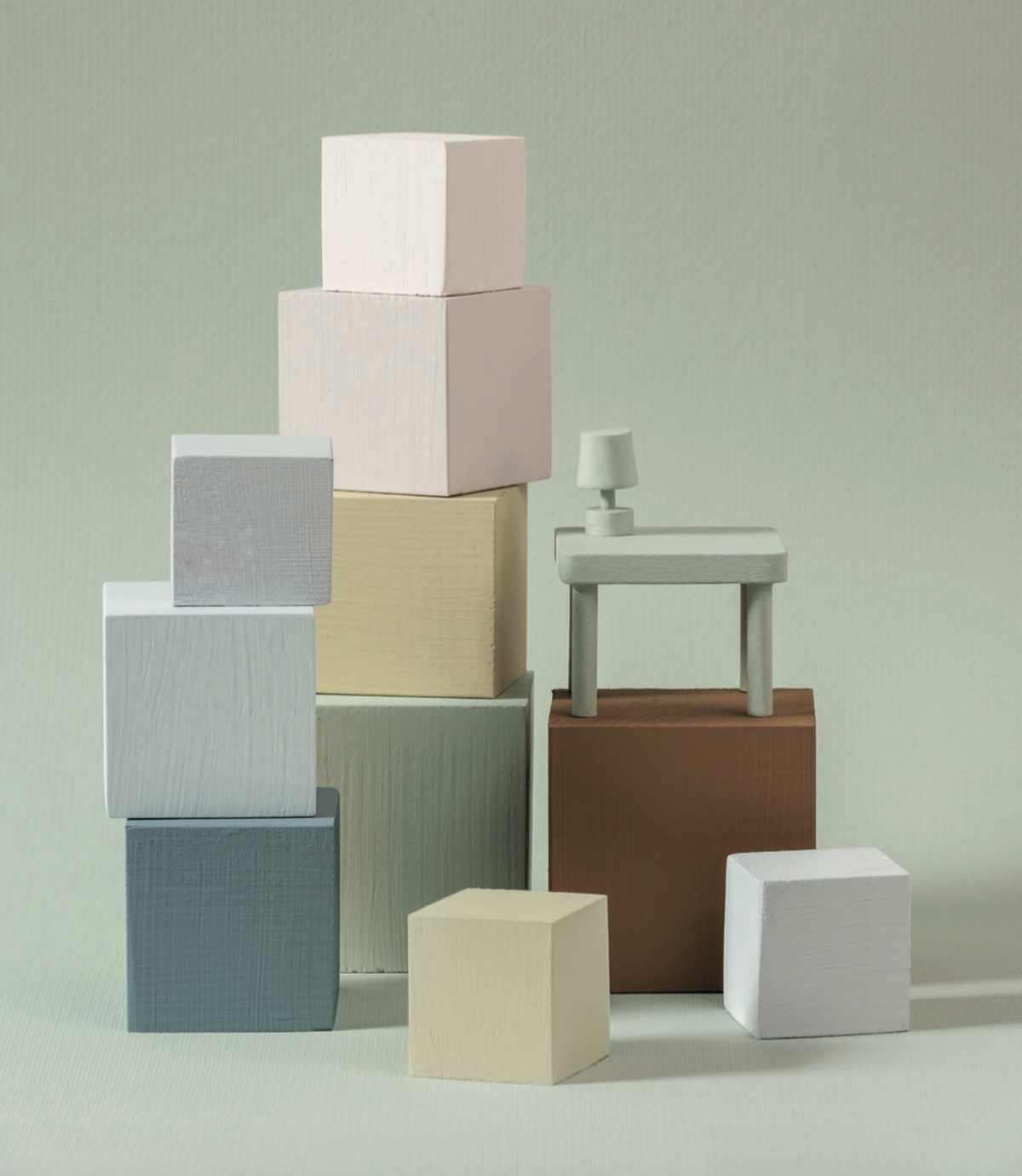
The Play Palette
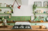
Dedicated to those who want a stimulating and fun environment that brings joy. This energizer palette is characterized by bold and bright colors. Modern and relaxed mood, this is inspired by a summer dawn full of colorful promises and sunshine. Here it is all matter of balance between neutral and restful tones of the color of the year combined with more bold and brave color blocks. The perfect match for this palette are modern geometric patterns and materials with personality like my beloved “terrazzo”.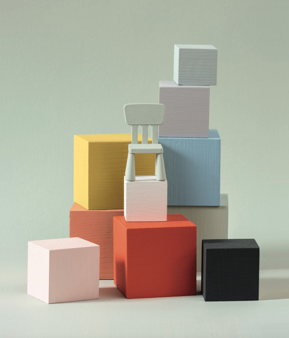
The Meaning Palette
This is the ideal palette for minimalists, for those who believe that Less is more, for those who want to rest their sight to rest their minds and live in a simple, almost monastic environment, with few objects to be able to restore importance of what really matter and put everything back in the right balance. In this color palette there are soft tones, simple and clean. The dawn that inspires Tranquil Dawn in here is one of those in clear and cold winter skies. No distractions, clean lines, functional shapes, tactile materials such as natural woods, linen, concrete. Simplicity lived as the maximum expression of luxury.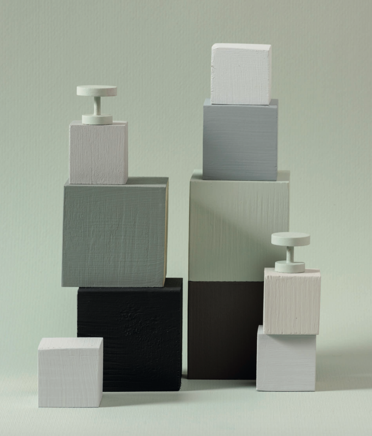
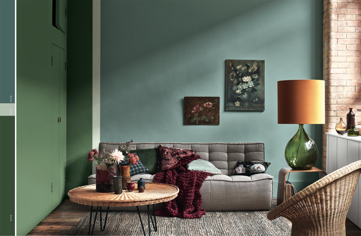
The Creativity Palette
This is the palette dedicated to those who are not afraid to dare, to those who love decoration, to those who want to express their creativity, to those who like to play mixing tradition with a modern twist. In this palette there are deep and important shades, inspired by autumn dawns where the colors are intense and warm.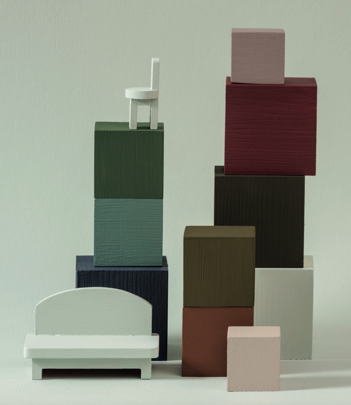
Among the four palettes, the “The Human Touch” mood and the color of the year remain the same, which here demonstrates its versatility by changing and changing according to the combinations.
Which palette do you recognize yourself in? The question seems simple but for me it was extremely tough. I recognize my current home in the first, the Care Palette, but at first glance I would choose the second one, full of vibrant and bold shades because I am always attracted by color accents. The third is a “I wish”, I would like to be more minimalist but I have the spirit of a terrible hoarder and I always need a touch of color. The last palette, The Creativity Palette, fascinates me, is the one in which I recognize the interiors that hypnotize me and where I find myself staring at every single detail, the one where perhaps an expert hand is needed in order to not exceed.
One last thing. Choosing the right color for the walls of your home is important for mental and physical well-being but it can also really be a help to reduce domestic air pollution. Did you know that at home we can breathe an air up to 5 times more polluted than outside? It is formaldehyde fault, a toxic gas that is released from furniture, carpets and domestic materials. The Alpha Air Clean line of AkzoNobel are a water-based paint capable of incorporating up to 80% of the formaldehyde molecules inside, cleaning the air.
I leave you in the contemplation of these beautiful palettes to decide which one is yours!
Photo ColourFutures 2020, AkzoNobel/Sikkens – Global Aesthetic Center
You may also like