Leggi questo post in Italiano
As usual Pantone has announced the color of the year, for 2018 it will be… Ultra Violet.
This announcement divided the web between those who love purple and who hates it. In Italy purple has not a super good perception because they say it brings bad luck (at least in theater and on tv) linked to the colors of the vestments during Lent.
The Prince’s ‘Purple’ from this Summer wasn’t enough? Evidently not, or Pantone is trying to tell us something.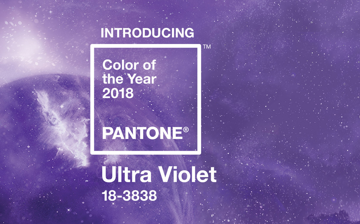
Ultra Violet was already in the color palette that Pantone launched for spring 2018, but we would never have imagined it would become the color of the year too.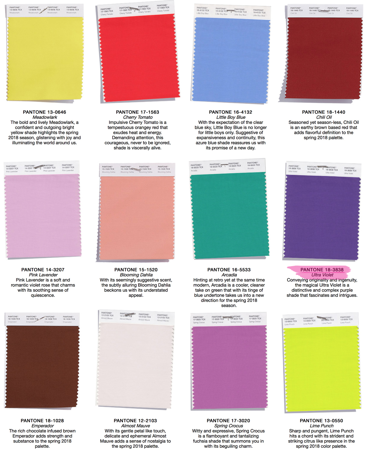
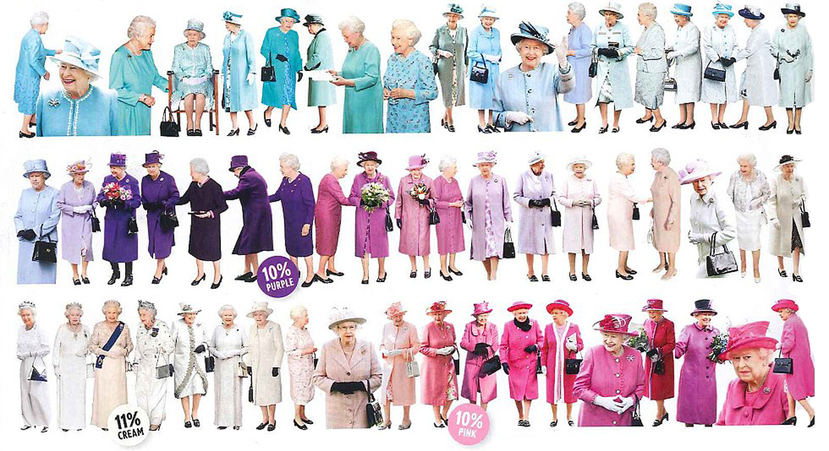
In England it’s totally another story: the British have a passion for purple especially their Royal Sovereign! Do not tell me that at the word “violet” you did not immediately think Queen Elizabeth’s outfits!
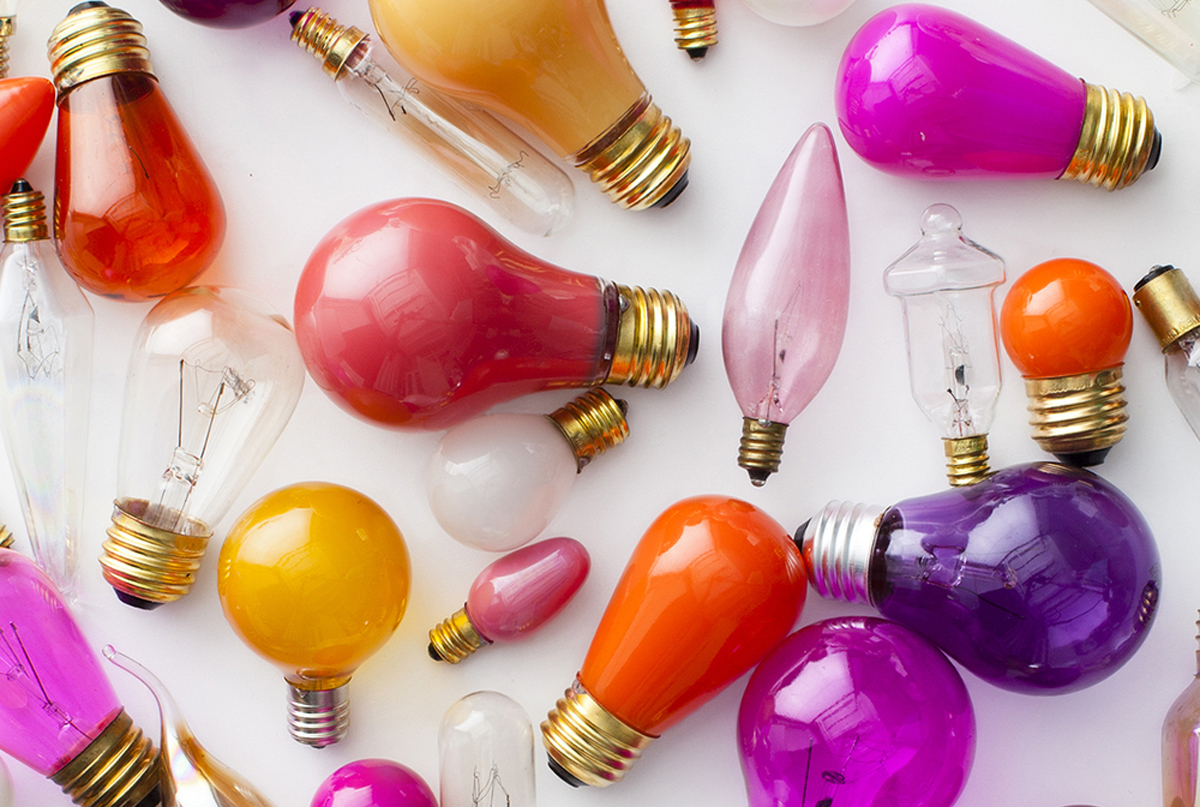
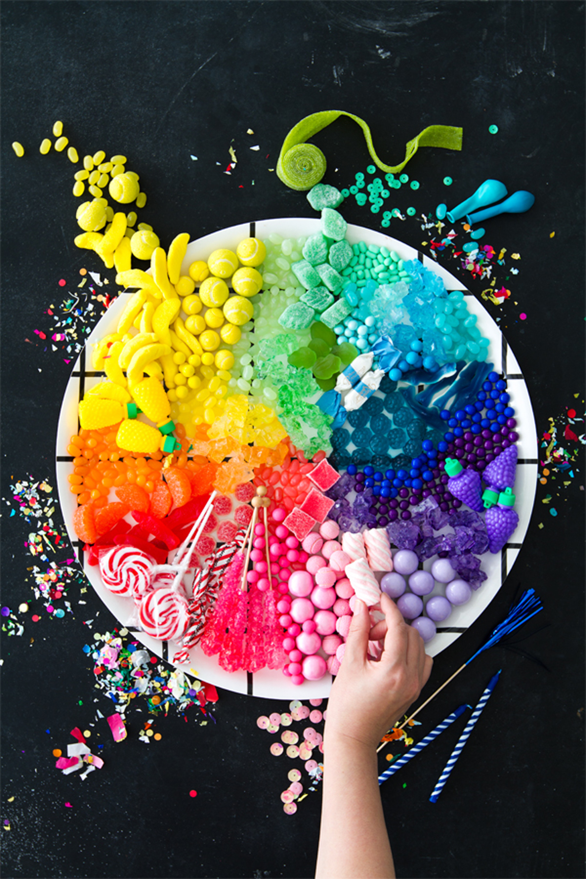
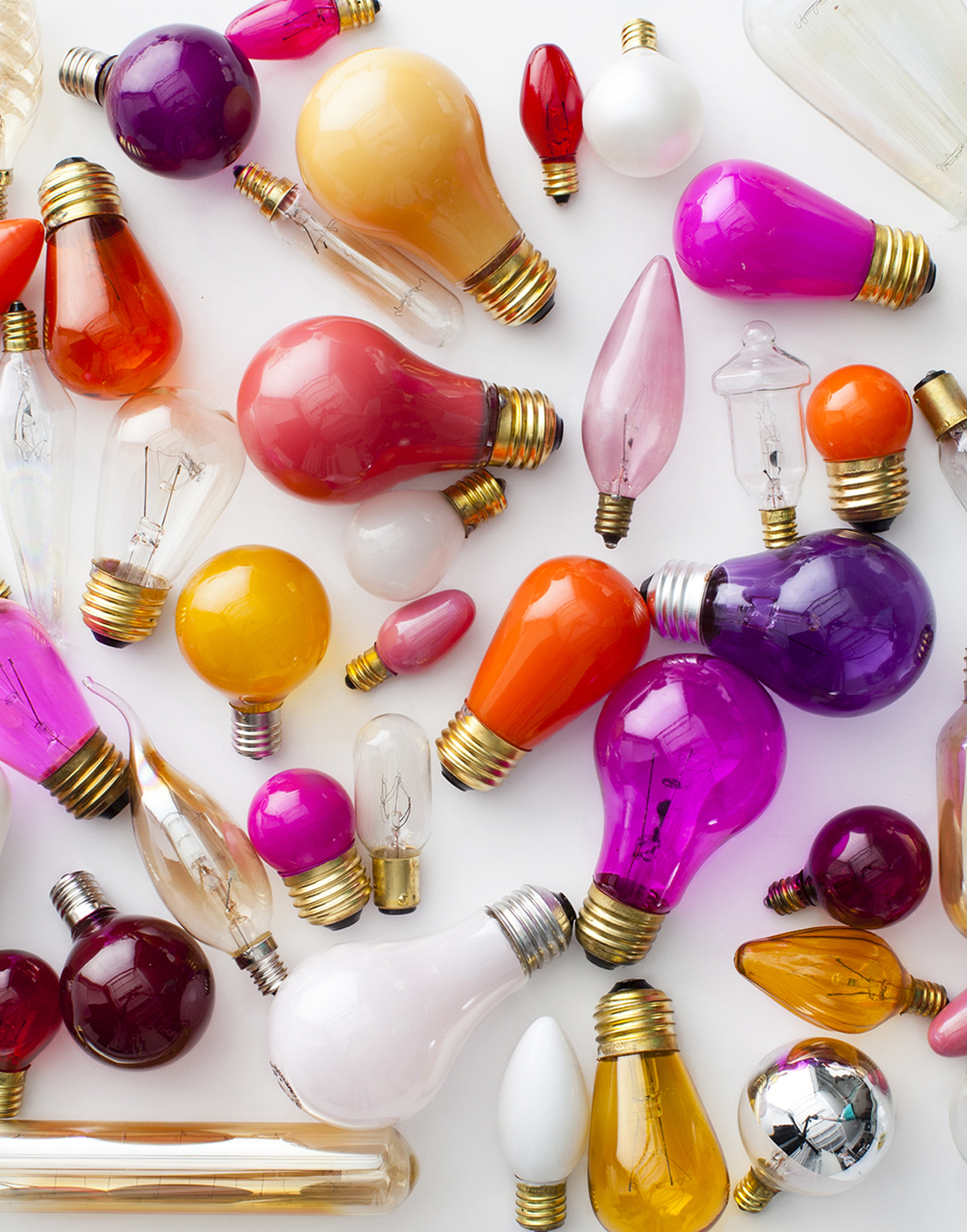
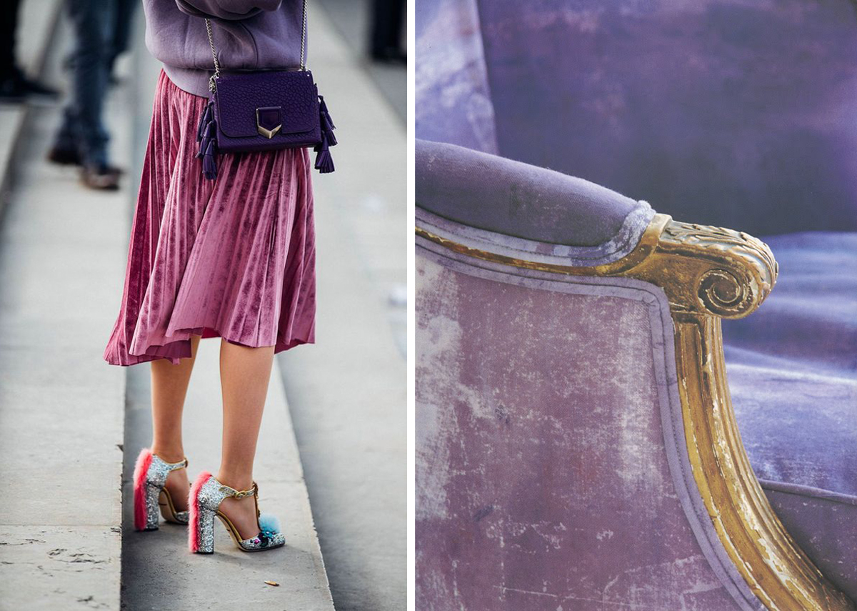
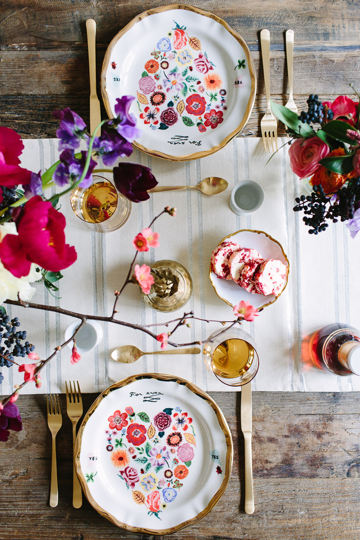
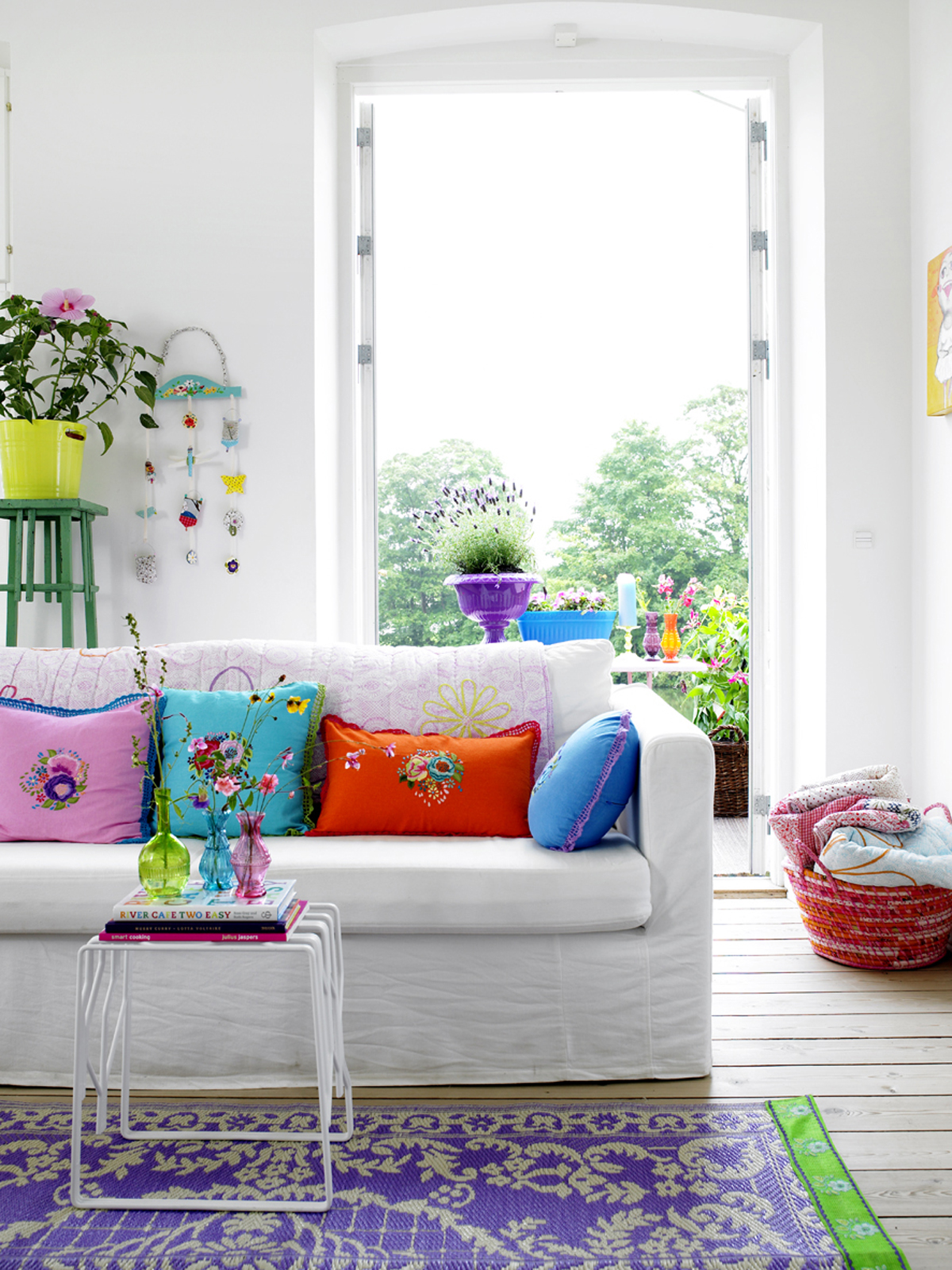
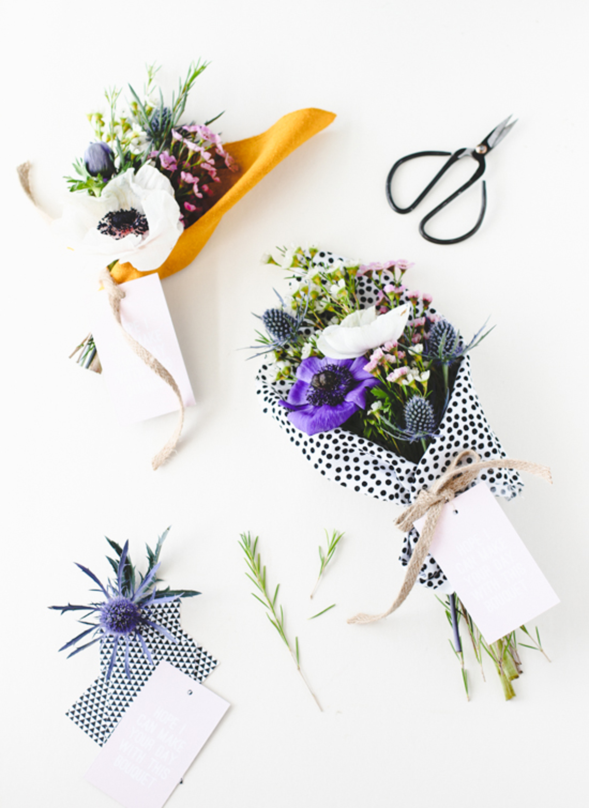
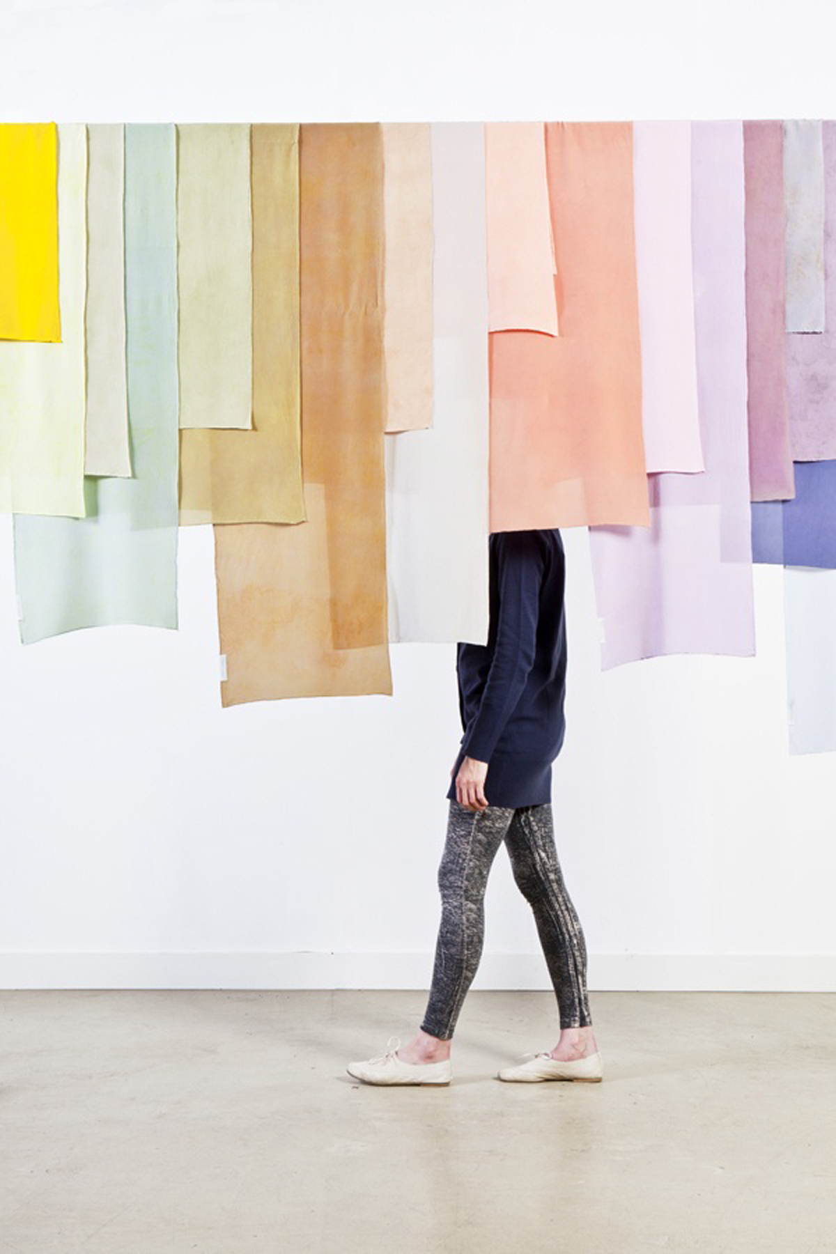
I admit it, I am not a big fan of violet, in fact, I own nothing (at least nothing I bought) in that color. But let’s not stop at the appearance. Let’s look at violet in the color range, let’s put it in small touches… everything changes perspective!
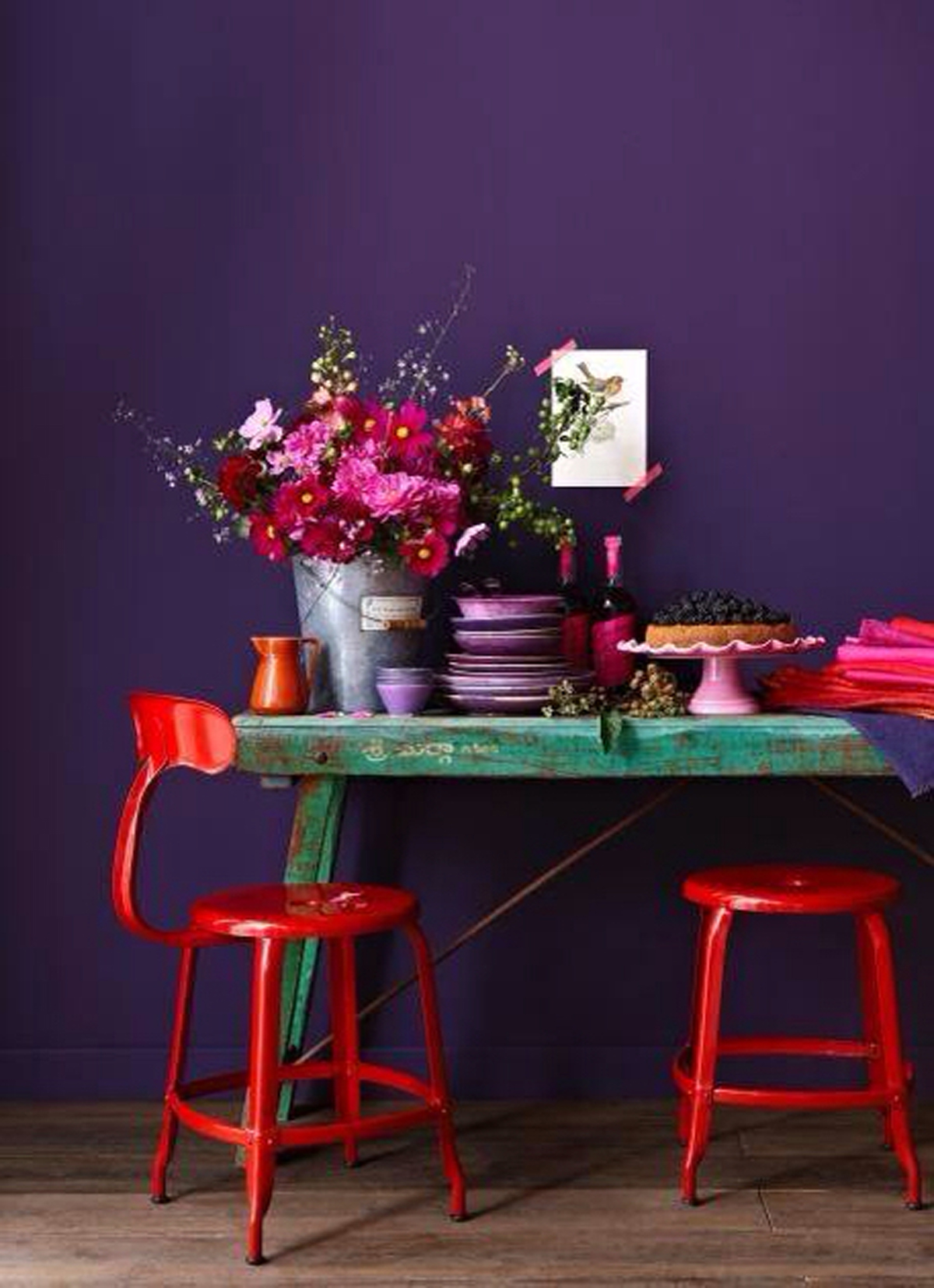
I’m not claiming total purple looks or monochromatic rooms, absolutely not. But imagine the details, maybe mixed with pink shades and maybe even with yellow… everything change!
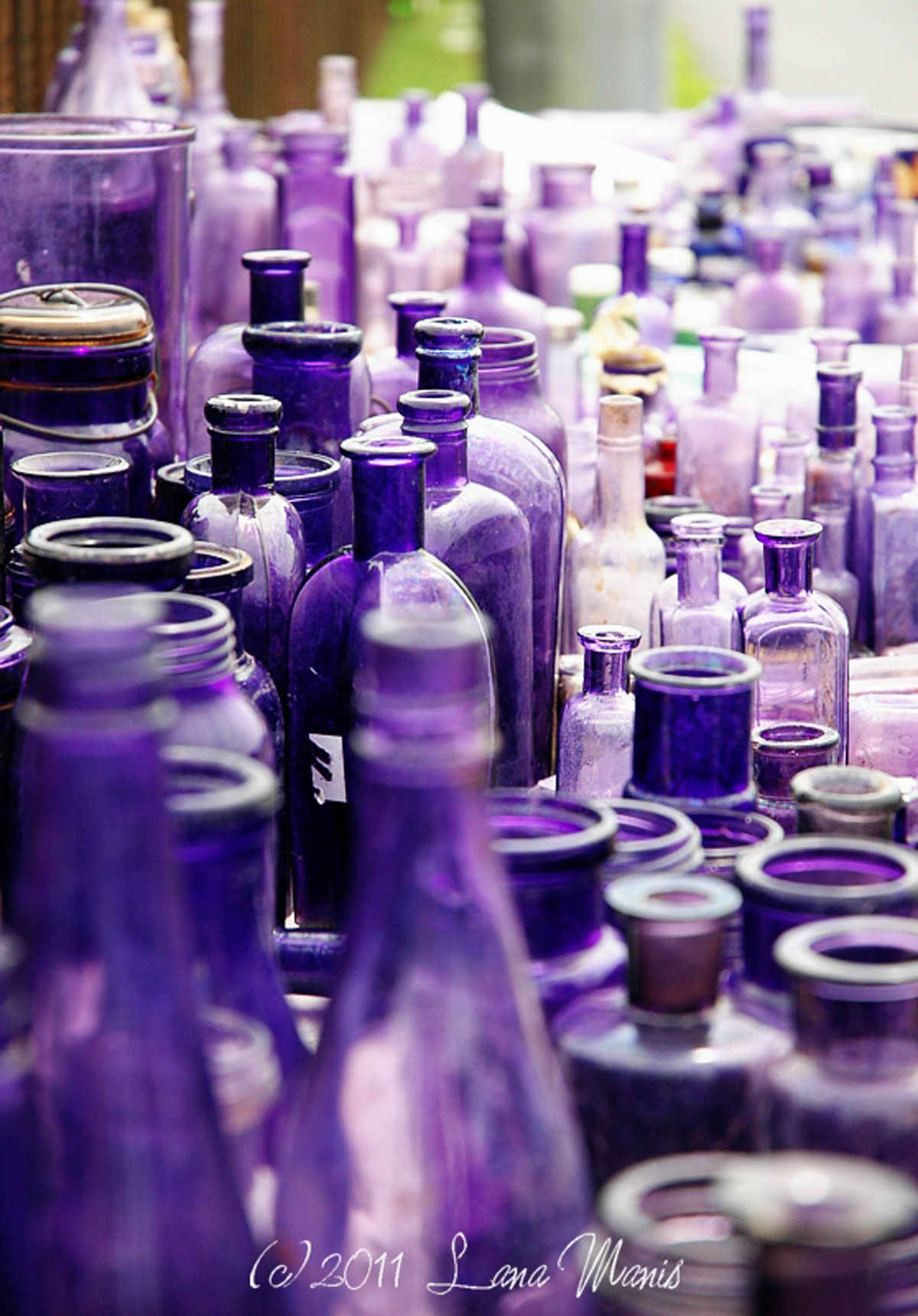
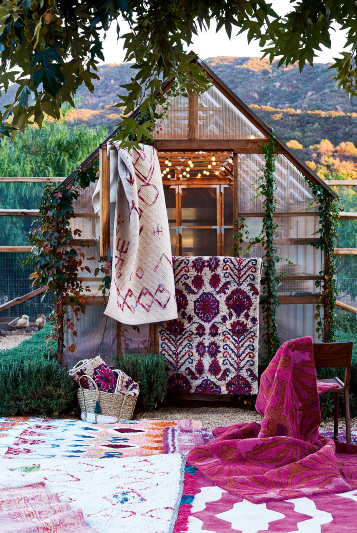
Small accents, violet details, can give a boho atmosphere to centerpieces and interiors.
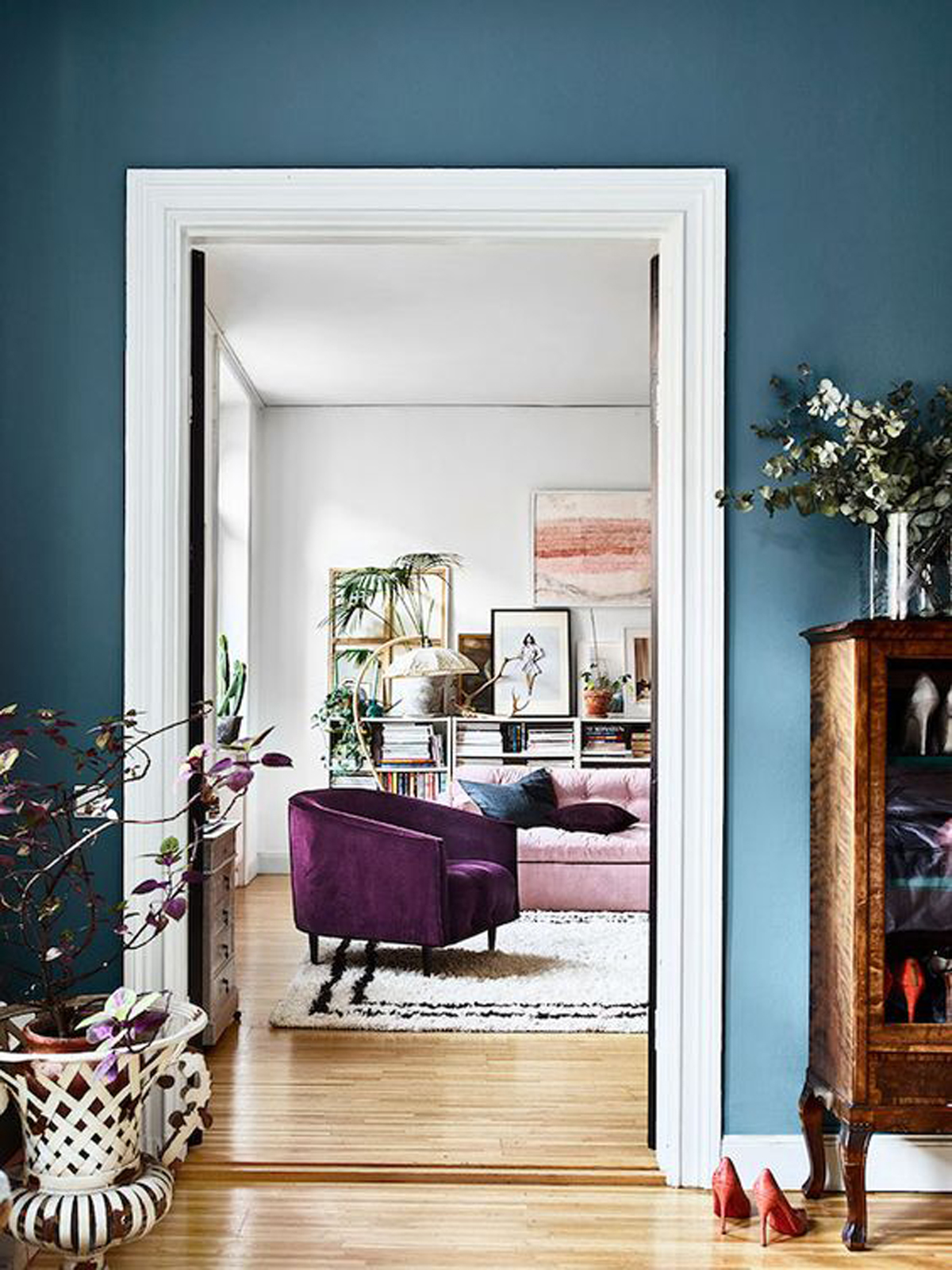
Vogue UK – Carolyn Quartermaine, Boiseriec
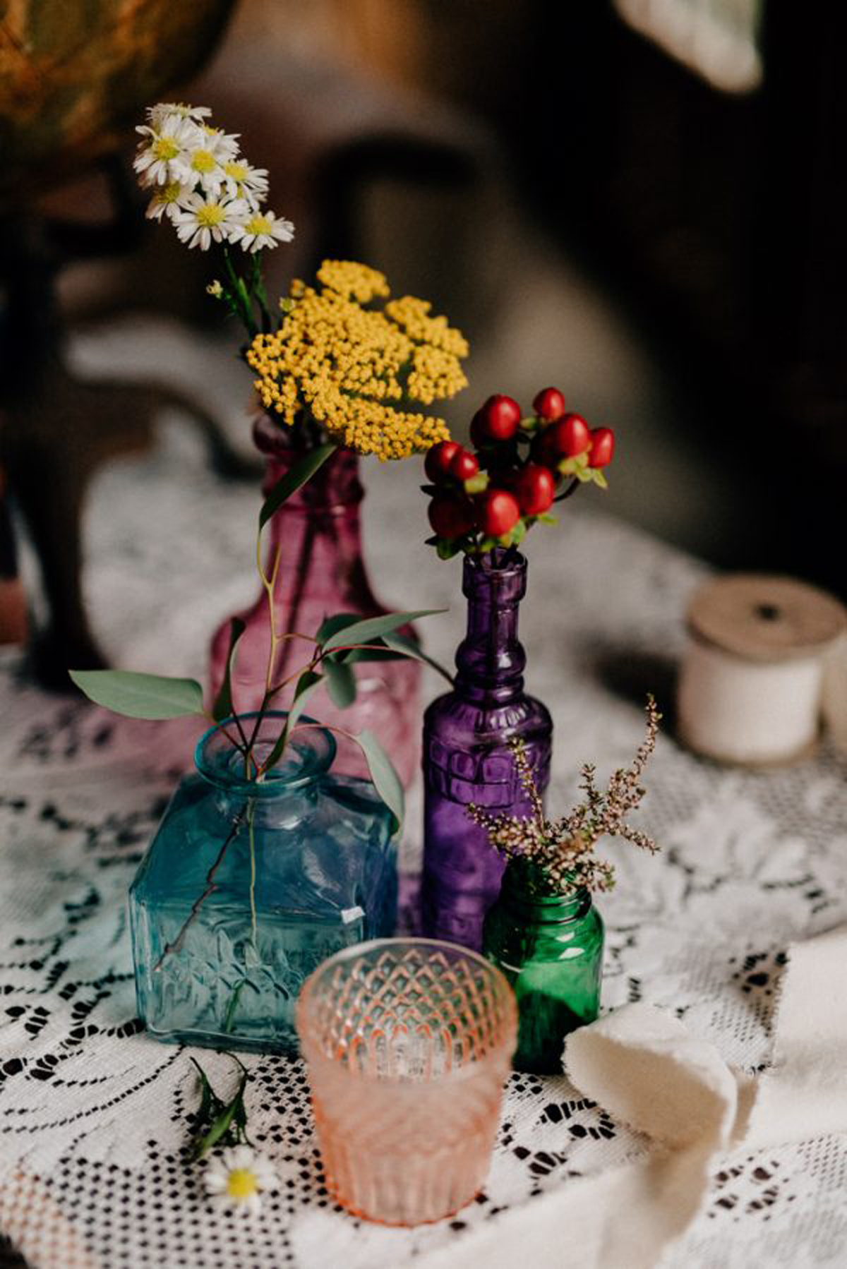
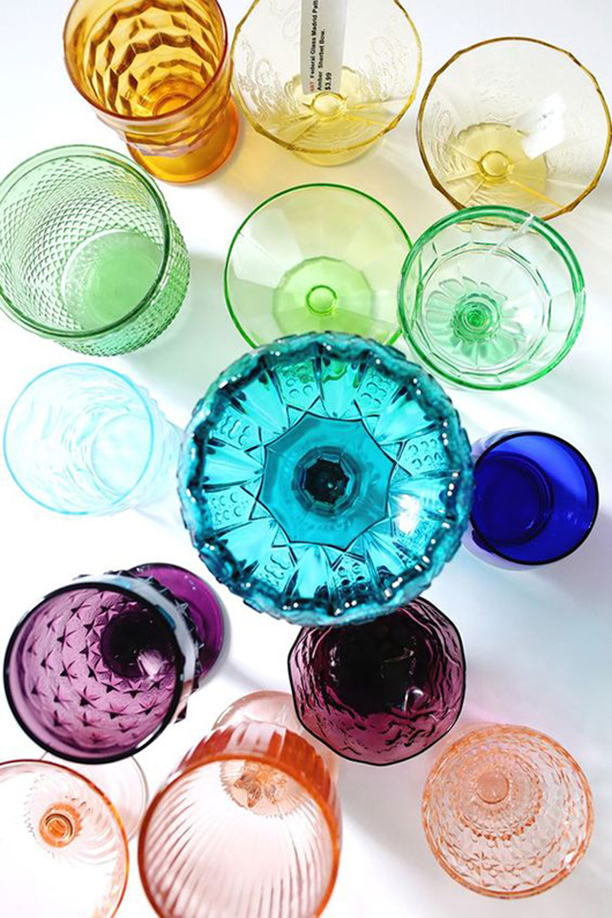
Imagine a desaturated violet, small touches in pale and luminous color palettes… admit that something changed!
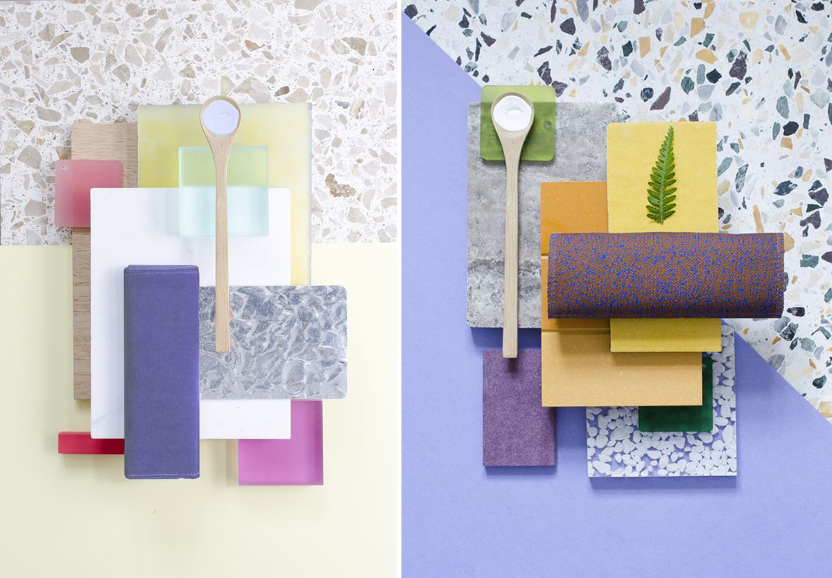
It could almost even enter the Nordic color palette. You will see, it will surprise us!
You may also like